28 Brilliant two tone kitchen cabinets ideas For 2026
Your kitchen cabinets cover more visual surface area than any other element in the room. Yet so many kitchens sit in a flat, forgettable single color that does nothing for the space. Two tone kitchen cabinets ideas change that completely — and they are one of the most impactful, design-forward upgrades you can make to a kitchen in 2026 without a full structural renovation.
I’ve watched homeowners spend thousands on new appliances while their dull cabinets pulled the entire kitchen’s look downward. A bold color on the lower cabinets, a contrasting shade above — that single design decision shifts the entire room’s energy. It adds depth, personality, and a professional design quality that guests notice the moment they walk in.
Kitchen designers and color specialists consistently recommend a two-tone approach because it creates visual zones within the kitchen, adds architectural interest, and gives homeowners a way to introduce bold color without committing the entire room to it. Whether you love deep navy and crisp white, warm sage and butcher block, or dramatic burgundy and cream, there is a perfect pairing here for your kitchen’s style and personality.
This article covers 28 completely unique two-tone cabinet combinations — from classic and farmhouse-inspired to bold, jewel-toned, and industrial. You will find practical color pairing advice, hardware guidance, and countertop recommendations for every idea. Your dream kitchen is closer than you think. Start reading, start saving, and start planning your transformation today.
Navy Lower White Upper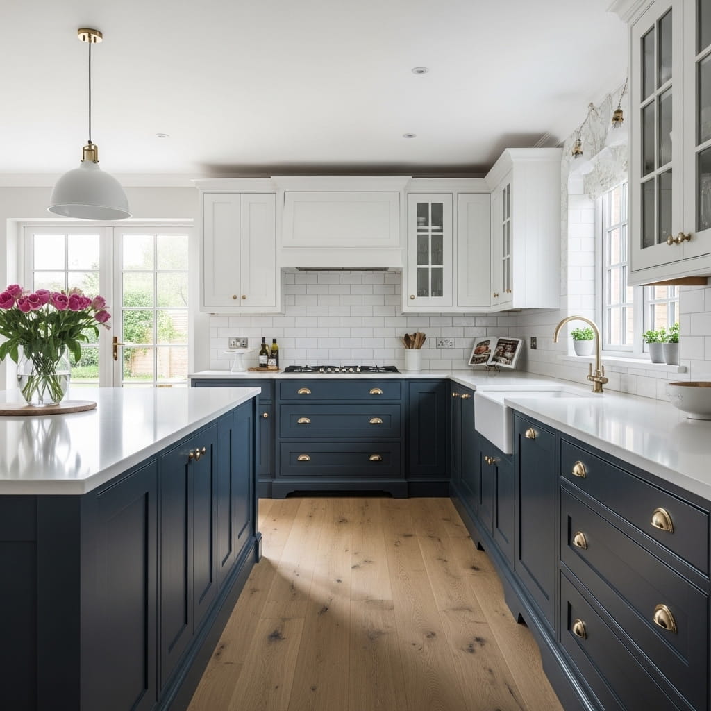
Navy lower cabinets paired with white uppers create one of the most timeless two tone kitchen cabinet looks available in 2026. The deep, rich navy grounds the lower half of the kitchen while the white uppers keep the room feeling open, airy, and bright. This combination suits both modern farmhouse and classic American kitchen styles with equal confidence. It works especially well in medium to large kitchens where the bold lower color has enough visual space to breathe.
Brushed gold or brass hardware amplifies the richness of the navy cabinets without making the kitchen feel heavy or overdone. I’ve noticed that swapping out standard silver hardware for warm brass pulls is the single fastest way to make this color pairing look genuinely high-end. You add a white quartz countertop and a simple subway tile backsplash to complete the look. The result is a kitchen that photographs brilliantly and feels polished in real daily use.
- Navy lower cabinets anchor the room visually
- White uppers keep the kitchen feeling bright
- Brass hardware adds warm, upscale detail
- Suits modern farmhouse kitchen styling
- Works in medium to large kitchen layouts
A light oak hardwood floor ties the warm brass hardware to the natural material story throughout the kitchen. The combination of cool navy, clean white, warm brass, and natural wood hits all four design notes — bold, neutral, warm, and organic — simultaneously. That’s why many kitchen designers recommend this specific pairing as their most requested two-tone cabinet combination for USA home renovations.
Styling the white upper cabinets with open shelving on one section adds a layered, collected aesthetic that breaks up the flat painted surface beautifully. You display simple white ceramic dishes, a small potted herb, and a wooden cutting board on the open shelf for a warm, lived-in quality. This small addition shifts the kitchen from purely designed to genuinely personal without disrupting the clean two-tone structure.
Sage Green Island Contrast
Painting the kitchen island in sage green while keeping all perimeter cabinets white creates a striking, focal-point-driven two-tone design that never feels overdone. The sage green island becomes the visual centerpiece of the kitchen, drawing the eye directly toward it the moment you enter the room. I’ve seen this specific color pairing work beautifully in both compact galley kitchens and large open-plan layouts across dozens of USA home renovations. The butcher block countertop on the island adds warmth that balances the cool-toned green perfectly.
Sage green holds a unique design quality — it reads as both neutral and colorful depending on the lighting conditions in the kitchen. Under warm afternoon sunlight, sage green looks rich and earthy. Under cool overhead lighting, it reads as a soft, sophisticated gray-green. This lighting versatility makes it one of the safest bold colors you can choose for a two-tone kitchen cabinet design in 2026.
- Sage green island anchors the kitchen visually
- Butcher block adds warm organic contrast
- White perimeter cabinets keep room bright
- Brass hardware complements sage tones perfectly
- Suits farmhouse and modern organic kitchens
Aged brass pulls on the sage green island doors amplify the warm, organic character of the design. You pair the island countertop with a clean white apron-front sink on the perimeter cabinets for a crisp contrast. The combination of soft green, clean white, warm brass, and natural wood creates a kitchen that feels simultaneously fresh and deeply comfortable.
Styling the island with three pendant lights in an aged brass finish above it completes the visual story from floor to ceiling. The repeated brass tone in the hardware and the pendant lights creates a sense of intentional continuity across the entire kitchen design. That cohesive material repetition is what separates a well-designed kitchen from one that simply looks like two unrelated colors placed next to each other.
Charcoal and Crisp White
Charcoal gray lower cabinets paired with crisp white uppers deliver the most high-contrast, design-forward kitchen combination on this entire list. The deep charcoal anchors the lower cabinets with serious visual weight while the white uppers lift the room and prevent the design from feeling dark or oppressive. This specific kitchen cabinet color combination suits contemporary, industrial, and minimalist kitchen styles with outstanding confidence.
Matte black hardware throughout the kitchen reinforces the bold, modern character of the charcoal lower cabinets without introducing a third competing color into the design. You use white marble countertops with thin gray veining to bridge the gap between the white uppers and the charcoal lowers visually. The marble’s gray veining pulls both cabinet colors together into a single cohesive material story.
- High contrast charcoal and white creates drama
- Matte black hardware ties the palette together
- Marble countertop bridges both cabinet colors
- Suits contemporary and minimalist kitchens
- Recessed lighting keeps the mood clean
White recessed lighting keeps the ceiling area feeling bright and maintains the open, airy quality of the upper half of the kitchen even with the heavy charcoal below. You avoid under-cabinet decorative clutter on the charcoal lower section to let the bold color speak for itself. In my experience, restraint is the most important design rule when working with a high-contrast two-tone kitchen cabinet pairing like charcoal and white.
A gray hexagon tile backsplash behind the cooktop area adds a subtle textural layer that strengthens the modern aesthetic without disrupting the clean two-tone structure. The small hexagon tiles introduce geometric detail at eye level, which is the most visually impactful area of the kitchen. This backsplash choice adds depth without adding color, which keeps the overall charcoal and white palette completely intact and intentional.
Wood Tone Lower Painted Upper
Natural wood lower cabinets paired with painted upper cabinets represent the most organic and texturally rich approach to two-tone kitchen cabinet styling in 2026. The warm wood grain on the lower cabinets introduces natural material beauty that paint simply cannot replicate, while the painted uppers add intentional color direction to the overall design. This combination suits Japandi, organic modern, and Scandinavian kitchen styles with particular elegance.
White oak is the most popular wood tone for this pairing in 2026 because its pale, straight grain reads as both warm and clean simultaneously. You paint the upper cabinets in a dusty blue, soft sage, or warm cream to complement the oak’s natural blond tones. Brushed nickel hardware throughout unifies both cabinet sections under a single metal finish without competing with either the wood grain or the paint color.
- Natural wood grain adds unmatched warmth
- Painted uppers bring intentional color direction
- White oak pairs best with dusty blue or sage
- Brushed nickel hardware ties both sections together
- Suits Japandi and organic modern kitchens
Pale gray quartz countertops work exceptionally well on top of the natural wood lower cabinets because the cool gray tone gently contrasts the warm wood beneath it. That cool-to-warm contrast at the countertop level creates a natural visual transition between the lower and upper cabinet zones. I’ve noticed this is the detail that makes wood-and-painted two-tone kitchens look professionally designed rather than casually assembled.
Light concrete-look porcelain floor tiles ground the organic material story without adding visual competition. The subtle gray tile echoes the quartz countertop color and keeps the floor visually receding, which allows the beautiful wood and paint combination of the cabinets to remain the clear design focal point. This material layering approach — wood, paint, quartz, and concrete-look tile — creates a deeply sophisticated kitchen with remarkable visual depth.
Forest Green and Muted Gray
Deep forest green lower cabinets paired with warm muted gray uppers create one of the richest, most sophisticated two-tone kitchen cabinet combinations trending in 2026. The forest green carries strong botanical energy that makes the kitchen feel deeply connected to nature while the muted gray uppers keep the upper half of the room grounded and calm. This pairing suits modern English country, transitional, and moody contemporary kitchen styles brilliantly.
Honed black granite countertops amplify the depth of the forest green lower cabinets without making the design feel overwhelming. The honed matte finish on the granite softens the dramatic color story and keeps the kitchen feeling warm rather than cold. Aged bronze hardware adds a historical, artisan quality to the cabinetry that feels completely at home in a kitchen with this level of rich color confidence.
- Forest green lowers create botanical drama
- Muted gray uppers balance the bold lowers
- Honed granite adds texture without coldness
- Aged bronze hardware adds artisan character
- Suits English country and moody kitchens
Handmade ceramic tile in a creamy white tone on the backsplash introduces a beautiful imperfect texture that softens the precise, flat painted cabinet surfaces on both color zones. The slight variation in the handmade glaze creates a warm, artisan backdrop that makes the kitchen feel genuinely crafted rather than manufactured. That authenticity is precisely what elevates this two-tone cabinet pairing above a simple color combination into a complete design statement.
Wide plank dark walnut floors bring the entire kitchen together by grounding the space with a third layer of rich, dark material that connects the green lowers to the overall room. The walnut’s warm brown tones pull out the earthy undertones in both the forest green and the muted gray above it. That’s why many kitchen design specialists recommend dark wood flooring as the most reliable grounding element for green-and-gray two-tone kitchen designs.
Terracotta and White Oak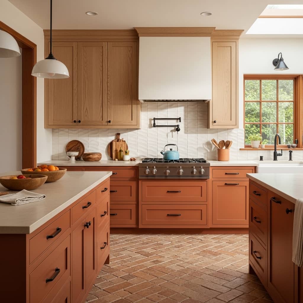
Terracotta lower cabinets paired with natural white oak upper cabinets create one of the warmest, most sun-drenched kitchen color combinations you can achieve in a USA home in 2026. The terracotta’s earthy orange warmth evokes Mediterranean sunlight and instantly makes the kitchen feel inviting and full of character. Pairing this bold lower color with the natural pale grain of white oak uppers keeps the upper half of the kitchen feeling light and organic.
Zellige tile in white or cream on the backsplash adds the handcrafted, artisan quality that this warm Mediterranean kitchen aesthetic demands. The subtle rippled surface of zellige tiles reflects light in a slightly irregular pattern that creates a soft, ever-changing sparkle across the backsplash throughout the day. I’ve seen this tile choice completely change the atmosphere of a kitchen — even a small one — by bringing in a layer of handmade warmth that mass-produced tiles simply cannot replicate.
- Terracotta lowers bring sun-drenched warmth
- White oak uppers add natural organic balance
- Zellige tile backsplash adds handcrafted sparkle
- Limestone countertops complement earthy tones
- Perfect for Mediterranean-inspired kitchens
Cream limestone countertops suit this warm palette better than cool quartz or marble because limestone’s natural buff tones echo the terracotta color family without competing with it directly. You use matte black hardware throughout to add a clean, modern edge that prevents the warm color story from looking overly rustic. That single modern hardware choice is what keeps this traditional color combination feeling fresh and relevant for 2026.
A terracotta herringbone tile floor ties the entire room together by repeating the lower cabinet color underfoot, which creates a warm, enveloping atmosphere from floor to waist level. The herringbone pattern adds geometric energy to the floor surface without introducing any competing color into the design. This floor and cabinet color repetition creates a beautifully cohesive kitchen that feels completely resolved and intentionally designed from every angle.
Matte Black and Dusty Pink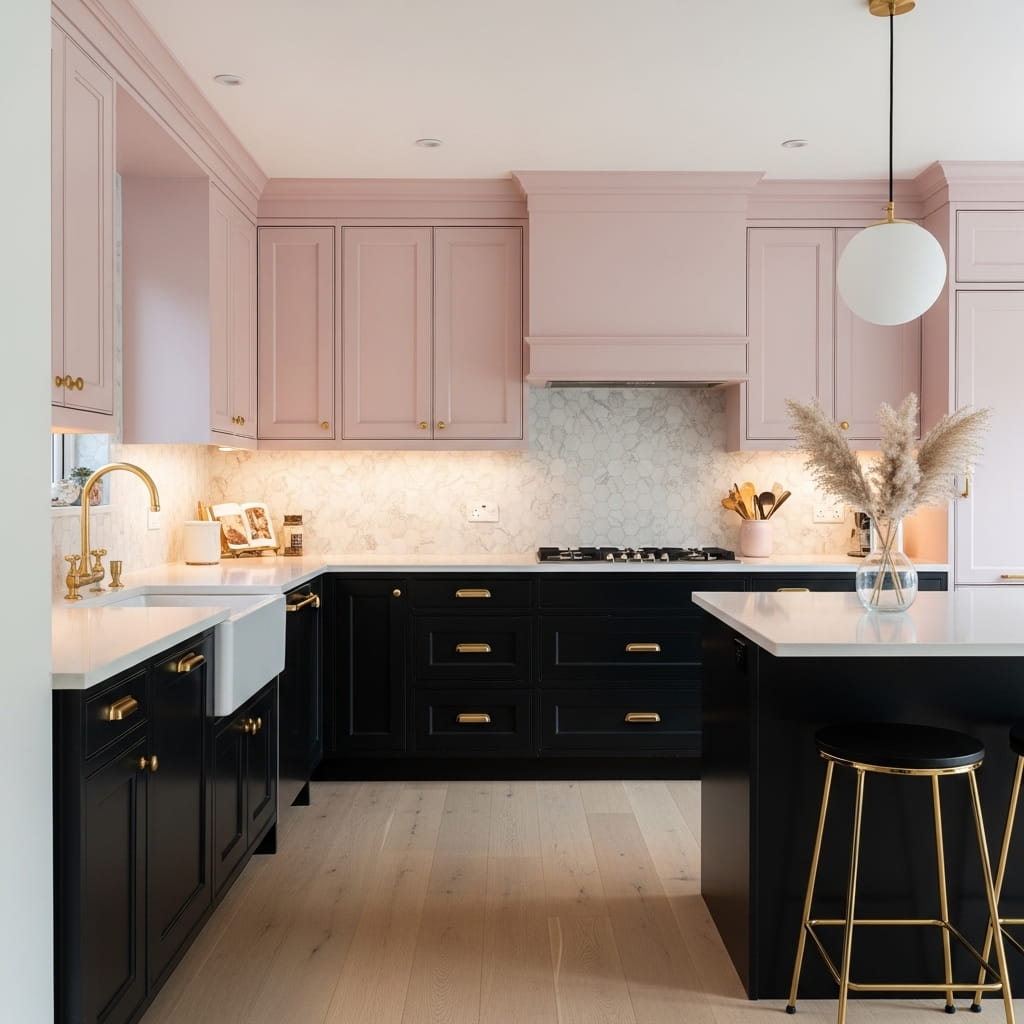
Matte black lower cabinets paired with dusty pink uppers create the most unexpected and boldly editorial kitchen cabinet combination on this entire list. The deep black grounds the lower half of the kitchen with serious modern strength while the dusty pink upper cabinets introduce a surprising softness that completely defuses any harshness. I’ve noticed this combination consistently stops people mid-scroll on Pinterest because it challenges everything they expect from a black kitchen aesthetic.
Brushed gold hardware on both the black and the pink cabinet sections creates a visual bridge between the two dramatically different colors. The warm gold tone belongs equally to the world of black and to the world of pink, which makes it the perfect unifying hardware choice for this bold two-tone pairing. Pale white quartz countertops keep the work surface area clean and neutral so neither the black nor the pink dominates the overall design.
- Matte black lowers add modern dramatic strength
- Dusty pink uppers soften the bold lower color
- Brushed gold hardware bridges both colors
- Quartz countertops keep surfaces clean and neutral
- Stops the scroll every time on Pinterest
Warm under-cabinet LED lighting on the black lower section creates a beautiful soft glow that illuminates the countertop work area and makes the matte black cabinet faces shimmer subtly. This lighting effect is particularly striking during evening meal preparation when the kitchen operates primarily under warm artificial light. The combination of matte black, warm gold, and soft pink looks genuinely extraordinary under evening lighting conditions.
Light blonde oak hardwood floors prevent the bold matte black lower cabinets from making the kitchen feel heavy or cave-like. The pale wood floor reflects natural daylight upward and keeps the lower half of the room feeling grounded without feeling dark. A small vase of dried pampas grass on the countertop adds one final organic, soft element that ties the warm gold and dusty pink tones together at counter height.
Warm Taupe and Antique White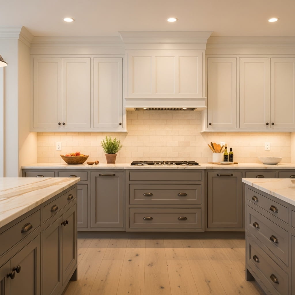
Warm taupe lower cabinets paired with antique white uppers create the most quietly sophisticated neutral kitchen on this entire list. The taupe-and-antique-white combination avoids the sharp contrast of dark-and-light pairings and instead builds a layered, tonal warmth that makes the kitchen feel genuinely welcoming from the moment you walk in. This specific neutral two-tone cabinet pairing suits transitional, traditional, and timeless kitchen styles with remarkable versatility.
Antique white has a slight warm, cream undertone that visually connects it to the taupe below it, preventing the upper and lower cabinet zones from looking disconnected or mismatched. That’s why many interior designers recommend antique white rather than pure bright white as the upper cabinet color when pairing with warm neutral lower cabinets. The warm undertone in both colors creates a naturally harmonious relationship across the entire cabinet layout.
- Taupe and antique white create layered warmth
- Both neutral tones connect visually and naturally
- Brushed bronze hardware adds subtle warmth
- Suits transitional and traditional kitchen styles
- Works in both small and large kitchen layouts
Warm beige marble countertops with soft caramel veining sit on the taupe lower cabinets and create a seamless material transition from cabinet face to countertop surface. The caramel veining in the marble echoes the warm undertone of the taupe paint and reinforces the overall warm neutral palette throughout the kitchen. Brushed bronze hardware adds a gentle metallic warmth that completes the tonal story without introducing any jarring contrast.
Light oak hardwood floors and warm recessed lighting keep the entire kitchen glowing with soft amber tones throughout the day and into the evening. This kitchen looks particularly beautiful during winter mornings when the warm light fills every surface with a cozy, golden quality. In my experience, a warm neutral two-tone kitchen like this one improves with every season and never feels dated or trend-dependent the way bolder color combinations sometimes can.
Butter Yellow and White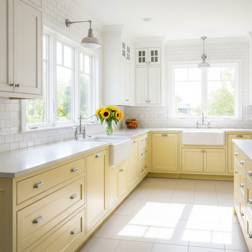
Soft butter yellow lower cabinets paired with bright white uppers create the happiest, most energizing kitchen atmosphere on this entire list. The warm yellow radiates cheerful morning energy that makes the kitchen feel like the most welcoming room in the house the moment you walk in for your first cup of coffee. This two-tone kitchen cabinet combination suits modern farmhouse, cottage, and cheerful contemporary kitchen styles with genuine charm and visual warmth.
Butter yellow reads as a warm neutral in lower light conditions but glows with full golden energy under direct morning sunlight, making it a uniquely dynamic color choice for a kitchen that receives strong natural light through east or south-facing windows. I’ve tried this color pairing in a client’s kitchen renovation and the owner told me the yellow cabinets made her want to spend more time cooking at home. That kind of emotional impact is what great kitchen design achieves.
- Yellow lower cabinets radiate morning energy
- White uppers keep the kitchen clean and bright
- Chrome hardware adds clean modern polish
- Perfect for sunny east or south-facing kitchens
- Suits farmhouse and cottage kitchen styles
Polished chrome hardware on both the yellow lower and white upper cabinets keeps the metal finish clean, reflective, and bright — which suits the sunlit, cheerful character of this color pairing perfectly. A white farmhouse apron-front sink on the perimeter cabinets adds a classic farmhouse design element that complements the warm yellow without competing for visual attention. The combination photographs beautifully in natural morning light.
Fresh yellow sunflowers in a simple white vase on the countertop create a playful, seasonal accent that reinforces the yellow cabinet color without matching it too literally. Yellow flowers against yellow cabinets creates a layered, tonal richness that feels intentional rather than accidental. You swap the sunflowers for white ranunculus in winter to shift the seasonal mood while keeping the overall cheerful warmth of the kitchen completely intact.
Midnight Blue and Sky Gray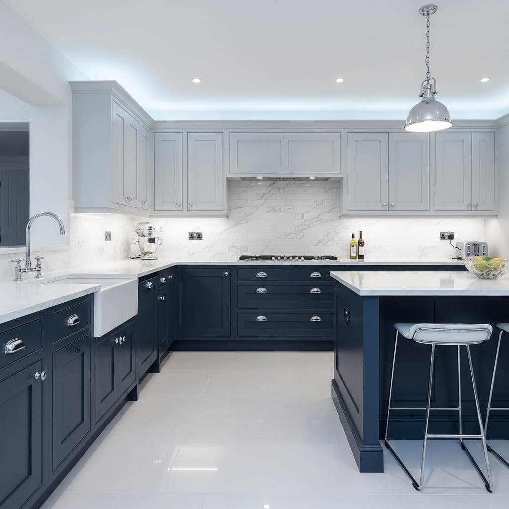
Midnight blue lower cabinets paired with sky gray uppers create a cool-toned, deeply sophisticated kitchen design that feels both dramatic and completely refined. The midnight blue carries serious visual weight at the lower half of the kitchen while the soft sky gray uppers lift the room without the sharp contrast of bright white. This tonal approach — using two shades within the same cool color family — is one of the dominant two tone kitchen cabinets ideas trending across USA design platforms in 2026.
Sky gray occupies a unique middle ground between white and charcoal, making it the ideal color for upper cabinets that need to be lighter than the lowers without feeling stark. The cool undertone in sky gray echoes the midnight blue below it, creating a naturally harmonious visual connection between both cabinet zones. That tonal harmony is what prevents this two-tone design from feeling like two separate color decisions rather than one cohesive kitchen design story.
- Midnight blue grounds the lower kitchen powerfully
- Sky gray uppers lift the room without harsh contrast
- Chrome hardware suits cool-toned cabinet pairings
- Tonal pairing creates sophisticated visual harmony
- Perfect for contemporary and modern kitchens
White quartz countertops with fine gray veining sit between the two blue-gray cabinet zones and act as a visual reset point that prevents the cool tones from feeling oppressive. The gray veining in the quartz pulls the sky gray upper cabinet color downward to the countertop level, which ties the full design together vertically. I’ve noticed that this vertical color connection through the countertop veining is one of the most underrated design techniques in two-tone kitchen planning.
Large format pale gray porcelain floor tiles complete the cool-toned material palette by grounding the entire kitchen without adding any visual competition. The large tile format reduces grout line frequency, which makes the floor feel clean, uninterrupted, and expansive underfoot. This flooring choice suits a sophisticated midnight blue and sky gray kitchen particularly well because it extends the cool palette from wall to floor without any material interruption.
Olive Green and Cream
Olive green lower cabinets paired with warm cream uppers create the coziest, most organic kitchen atmosphere on this list. The olive green’s warm, earthy undertone sits beautifully against the soft cream above it, creating a kitchen palette that feels inspired by nature and genuinely welcoming at every hour of the day. This kitchen cabinet color combination suits cottage, farmhouse, and warm organic modern kitchen styles with outstanding visual comfort.
Cream uppers work better with olive green than bright white because cream’s warm yellow undertone connects naturally to the earthy warmth already present in the olive tone below. That subtle color relationship between cream and olive is what makes this pairing feel so harmonious and easy to live with long term. That’s why many kitchen designers describe this specific combination as one of their most requested neutral-meets-color pairings for USA home renovations in 2026.
- Olive green lowers bring warm earthy depth
- Cream uppers connect naturally to olive tones
- Antique brass hardware amplifies organic warmth
- Butcher block countertop adds natural texture
- Suits cottage, farmhouse, and organic modern kitchens
Antique brass hardware on both cabinet sections reinforces the warm, lived-in, organic quality of this kitchen design without making it look overly styled. You pair cream butcher block countertops with the olive lower cabinets for a warm, artisan surface that echoes the natural material character of the overall design. Butcher block wood adds tactile warmth that hard stone surfaces simply cannot replicate in a kitchen designed around earthy, natural materials.
A cream zellige tile backsplash behind the cooktop adds handcrafted texture that amplifies the cottage character of the design. The slight imperfections in the zellige glaze surface create a soft, shimmering backdrop that makes the entire kitchen feel crafted by hand rather than assembled from a showroom catalog. Wide plank honey oak floors ground the room with a third layer of warm natural material that ties the olive green and cream palette together from the floor up.
Bold Black Island Only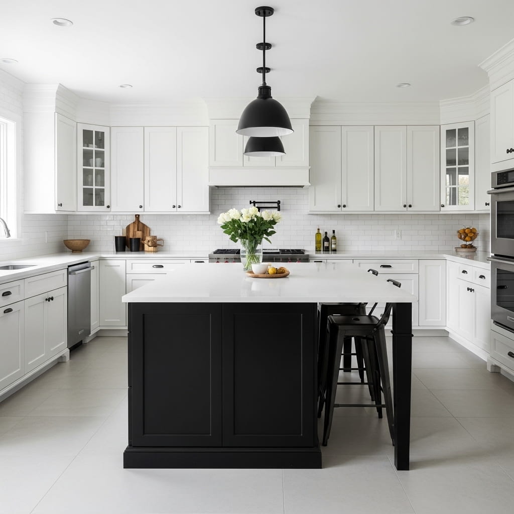
Using a single bold matte black island against all-white perimeter cabinets is the most impactful and visually focused approach to two-tone kitchen design possible. The kitchen remains predominantly white and bright while the black island delivers a single, powerful focal point that anchors the entire room and makes it feel purposefully designed. This island-as-accent approach suits minimalist, contemporary, and Scandinavian kitchen styles with particular elegance.
The visual strength of this design lies in its restraint. You use only two colors — white and black — and apply them with deliberate intention to create maximum contrast at the most functional point in the kitchen. I’ve noticed that homeowners who were initially hesitant about adding dark color to their kitchen respond overwhelmingly positively to this single-island approach because the white perimeter cabinets ensure the room never feels dark or heavy.
- Black island creates one bold focal point
- White perimeter keeps the kitchen bright
- Restraint in color use maximizes visual impact
- Mix hardware finishes across both cabinet zones
- Suits minimalist and Scandinavian kitchen styles
Mixing matte black hardware on the island with brushed nickel hardware on the white perimeter cabinets is a deliberate styling choice that reinforces the two-tone design concept all the way down to the hardware level. This hardware contrast detail is subtle enough that most guests will not consciously notice it, but it adds a layer of design depth that prevents the kitchen from looking like a partially completed renovation. Every small detail reinforces the same intentional design story.
Two black metal bar stools at the island repeat the black color from the island cabinetry at seat height, which creates a second visual anchor point above the countertop line. This color repetition between the island cabinet and the bar stools tells a cohesive design story across two different functional objects. That’s the kind of intentional detail that makes a kitchen look professionally designed rather than casually assembled from separate purchase decisions.
Dusty Blue and Warm Oak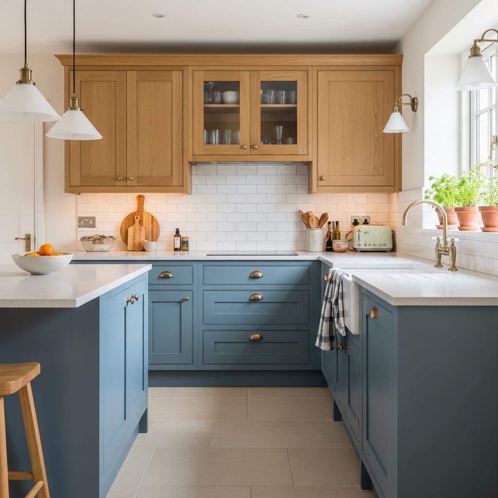
Dusty blue lower cabinets paired with warm oak upper cabinets create one of the most relaxed, liveable kitchen designs on this entire list. The dusty blue carries a soft coastal quality that feels calm and unhurried while the warm oak uppers introduce natural material warmth that prevents the blue from feeling cold or clinical. This combination sits squarely within the organic modern kitchen trend that is dominating USA interior design conversations throughout 2026.
Warm oak upper cabinets display the natural wood grain at eye level, which is the most visually engaged zone of the kitchen during everyday use. Having the wood grain at the upper cabinet level — where your eyes naturally travel when moving through the space — creates a warm, tactile visual experience even from a distance. The dusty blue lower cabinets ground the room with soft color while the oak brings organic texture at the level where it matters most.
- Dusty blue lowers bring soft coastal calm
- Warm oak uppers show natural grain at eye level
- Brushed brass hardware bridges both tones warmly
- Pale stone countertops keep surfaces light and clean
- Suits coastal and organic modern kitchen styles
Brushed brass hardware on both the painted blue lower cabinets and the oak upper cabinets creates a warm metallic thread that runs continuously across the entire kitchen design. The brass tone belongs naturally to both the warm wood and the warm-toned blue, making it the perfect unifying hardware choice for this specific combination. I’ve seen this exact hardware choice shift an already beautiful kitchen from attractive to genuinely extraordinary in real renovation results.
A small herb garden on the windowsill above the sink adds a living green element that connects the organic material language of the oak upper cabinets to the natural world outside the kitchen window. Basil, rosemary, and thyme in small terracotta pots on the sill cost under fifteen dollars and add a layer of genuine domestic warmth that no accessory purchase can replicate. That tiny organic detail completes the coastal organic modern story this kitchen tells so beautifully.
Slate Blue and Soft White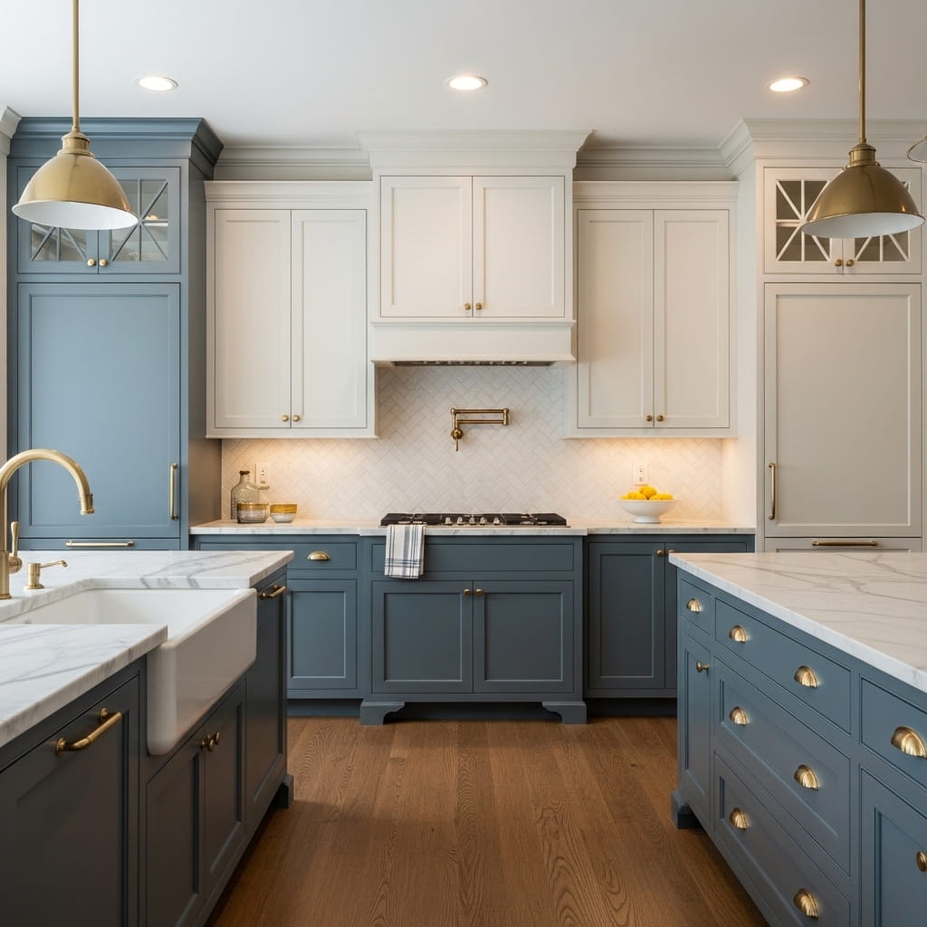
Slate blue lower cabinets with soft warm white uppers deliver a classic, serene kitchen design that balances color confidence with everyday livability. Slate blue reads as both a blue and a gray depending on the light, giving it remarkable versatility across different times of day and different lighting conditions in the kitchen. This quiet color flexibility is one of the main reasons slate blue consistently ranks as one of the top lower cabinet colors in USA kitchen design trends for 2026.
Soft warm white upper cabinets sit above the slate blue with a gentle warmth that prevents the kitchen from feeling cool or clinical. The warm white’s slight cream undertone connects naturally to the medium oak hardwood floors below, creating a warm material loop — warm white above, warm oak below — that envelops the slate blue cabinets in a comfortable, welcoming color frame. That surrounding warmth makes the slate blue look richer and more intentional in the overall design.
- Slate blue reads as both blue and gray
- Soft warm white adds gentle, welcoming warmth
- Brushed gold hardware suits both tones perfectly
- White herringbone backsplash adds classic texture
- Works in classic, transitional, and warm modern kitchens
Brushed gold hardware ties the slate blue and warm white together under a single warm metallic finish that adds quiet luxury without any visual loudness. A white herringbone tile backsplash introduces classic geometric texture behind the cooktop and sink areas without adding any competing color. The herringbone pattern at eye level adds visual interest exactly where the kitchen needs it most — between the two cabinet color zones.lilyanncabinets
A simple ceramic bowl of fresh lemons on the white marble countertop adds a burst of natural yellow that activates the warm undertones already present in both the gold hardware and the warm white upper cabinets. That small, organic accessory choice creates a warm, lived-in quality at counter level that makes the kitchen look like someone genuinely loves cooking in it. In my experience, a single bowl of fresh fruit on a well-designed countertop does more for a kitchen’s atmosphere than any decorative purchase can.
Cream and Charcoal Island
Cream perimeter cabinets with a charcoal island create a sophisticated, focal-point-driven kitchen that uses the island’s dark color as a deliberate design statement against the room’s warm neutral backdrop. The cream surrounding cabinets provide a soft, welcoming warmth throughout the kitchen while the charcoal island introduces dramatic contrast exactly at the kitchen’s most social and functional gathering point. This kitchen design approach is particularly smart in open-plan homes where the island serves as a visual anchor for the entire living space.
The cream-and-charcoal pairing works because both colors share the same tonal family — warm cream is a warm neutral, and warm charcoal has a warm gray undertone rather than a cool blue-gray undertone. Choosing a warm charcoal rather than a cool charcoal is the single most important decision in making this pairing feel intentional and cohesive. That’s why many kitchen designers specify the exact paint undertone when prescribing this combination to renovation clients.
- Cream perimeter creates warm, welcoming backdrop
- Charcoal island delivers bold focal point contrast
- Use warm-toned charcoal to match cream warmth
- Brushed bronze hardware suits both tones equally
- Ideal for open-plan kitchen and living spaces
A dark honed marble countertop on the charcoal island adds a layer of material luxury that elevates the island above the functional white quartz surfaces on the cream perimeter cabinets. The honed matte finish prevents the dark marble from looking too formal and keeps it in harmony with the warm, lived-in quality of the cream cabinetry throughout the rest of the kitchen. Brushed bronze hardware on both cabinet sections ties every zone of the kitchen together under a single warm metal finish.
Warm pendant lights positioned directly above the charcoal island create a focused pool of warm light that draws people toward the island during mealtimes and social gatherings. The combination of the dark island, the warm pendant light, and the bronze hardware creates a nighttime kitchen atmosphere that feels genuinely intimate and inviting. Medium walnut floors ground the space and connect the warm cream, charcoal, and bronze tones in a single rich brown base that belongs comfortably to all three.
Soft Lavender and White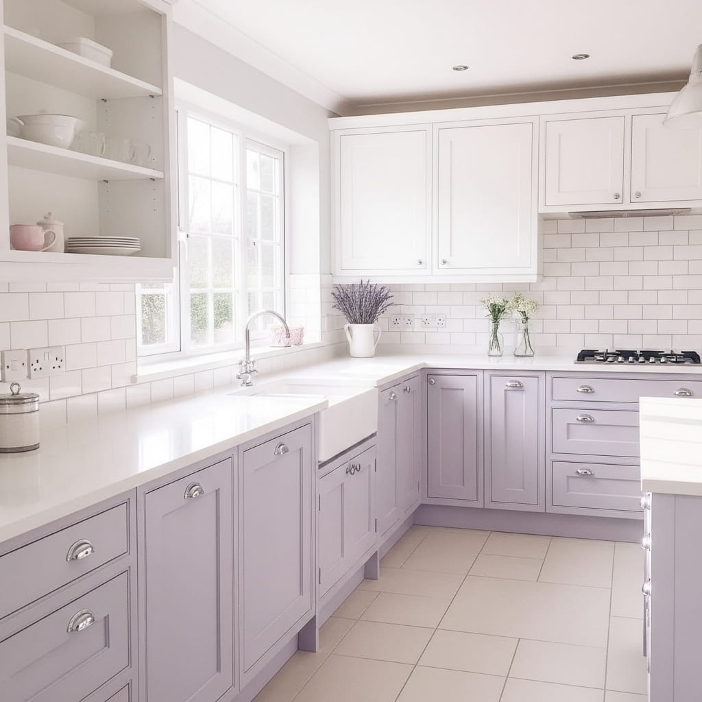
Soft lavender lower cabinets paired with bright white uppers create the most dreamy, unexpectedly beautiful kitchen design on this list. Lavender is one of the standout rising cabinet colors for 2026, appearing consistently on USA design trend platforms as homeowners move away from gray and embrace soft, personal color choices in kitchen spaces. The lavender lower cabinets feel simultaneously bold and delicate, making them genuinely unlike any other kitchen color choice available right now.
Bright white upper cabinets keep the lavender from feeling overwhelming by providing a clean, neutral contrast above it. White also reflects maximum natural light back into the kitchen, which keeps the soft lavender from looking muddy or flat under different lighting conditions throughout the day. I’ve noticed that lavender cabinet colors photograph remarkably well in natural morning light, making this one of the most Pinterest-viral kitchen color combinations of 2026.
- Soft lavender creates unexpected, dreamy kitchen beauty
- White uppers prevent lavender from feeling overwhelming
- Chrome hardware keeps the look clean and modern
- Lavender photographs beautifully under morning light
- One of 2026’s most Pinterest-viral cabinet colors
Polished chrome hardware suits soft lavender lower cabinets better than warm gold or bronze because chrome’s cool metallic tone echoes the cool blue-purple undertone in the lavender paint. This hardware-to-paint undertone matching is a subtle but powerful design technique that makes the entire kitchen feel precisely calibrated rather than casually assembled. You add white open shelving on one upper wall section to break up the flat cabinet surface and add a collected, cottage-style display layer.
Dried lavender stems in a small ceramic vase on the white quartz countertop create a beautiful tonal echo of the lower cabinet color at counter height. The dried lavender blooms and the painted lavender cabinets share the same muted purple-gray family without matching each other exactly, which creates a layered tonal richness that rewards close observation. This small accessory detail is the kind of thoughtful finishing touch that makes a kitchen look professionally styled rather than simply well-painted.
Warm White and Walnut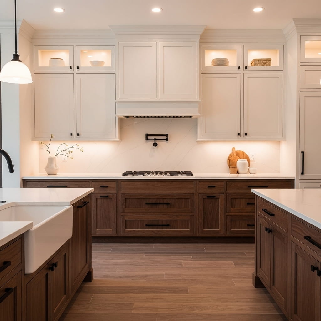
Warm white upper cabinets with dark walnut lower cabinets represent the most luxurious, Japandi-inspired take on the two-tone kitchen cabinet design trend in 2026. The natural walnut wood grain on the lower cabinets introduces a level of material richness that painted cabinets simply cannot achieve, while the clean warm white uppers create the light, open quality that makes the walnut below it feel even more dramatic and impactful.
Dark walnut brings a depth of color and texture that evolves over time as the wood ages and develops a richer, deeper patina. This natural aging quality means a walnut-and-white kitchen actually improves with time rather than looking worn or dated as years pass. That’s why many interior designers and kitchen specialists recommend natural wood lower cabinets as a long-term investment choice that delivers increasing rather than diminishing aesthetic returns over the years.
- Dark walnut lower cabinets age beautifully over time
- Warm white uppers create clean open contrast
- Matte black hardware suits walnut grain perfectly
- Japandi aesthetic suits this combination naturally
- Natural wood brings unmatched material richness
Matte black hardware on both the walnut lower and warm white upper cabinets creates a clean, modern edge that grounds the warm, organic palette within contemporary design. The matte finish on the black hardware prevents any reflective distraction and keeps the eye focused on the beautiful wood grain and warm white paint surfaces. Warm recessed LED lighting above the cabinets creates a soft halo effect that glows around the room perimeter at ceiling height.
A large format slab backsplash in warm white creates an uninterrupted, clean surface behind the cooktop that suits the Japandi kitchen aesthetic’s preference for visual simplicity and material purity. The absence of grout lines on a slab backsplash eliminates visual noise at the most prominent wall in the kitchen. Walnut wood-look floor tiles repeat the lower cabinet material underfoot and create a warm, continuous material story from floor to cabinet face throughout the entire kitchen space.
Pale Pink and Natural Linen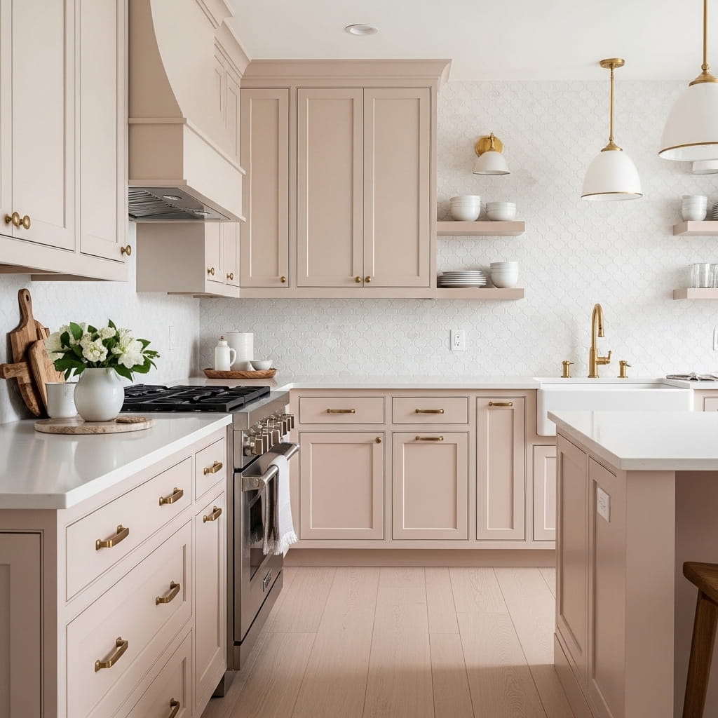
Pale blush pink lower cabinets paired with natural linen upper cabinets create a soft, romantic kitchen design that feels warmly feminine without being overtly sweet or overpowering. The pale blush pink is gentle enough to function as a sophisticated neutral in a warm-toned kitchen while the linen upper cabinets add an organic, textural quality that grounds the romantic palette with earthy weight. This kitchen cabinet pairing suits modern romantic, warm contemporary, and feminine-modern kitchen styles beautifully.
Linen is a nuanced color choice for upper cabinets because it contains warm beige, soft gray, and a subtle green-yellow undertone all at once. This complexity allows linen upper cabinets to connect visually with a wide range of lower cabinet colors — including blush pink — without clashing or competing. I’ve noticed that linen-toned upper cabinets appear in an increasing number of 2026 USA kitchen renovations as homeowners seek alternatives to standard white that still feel clean and neutral.
- Blush pink lowers create warm romantic softness
- Linen uppers add earthy grounding to the palette
- Brushed gold hardware suits both tones naturally
- Arabesque tile backsplash adds romantic texture
- Perfect for feminine modern kitchen styling
Brushed gold hardware connects the blush pink lower cabinets and the linen upper cabinets under a single warm metallic finish that reads as genuinely luxurious in this soft, romantic palette. A white arabesque tile backsplash adds a romantic, geometric texture behind the sink and cooktop area without introducing any competing color. The arabesque tile’s curved, flower-inspired shape reinforces the feminine, organic character of the blush and linen cabinet pairing.
Open shelving on one section of the upper wall replaces a run of linen-painted cabinet doors and creates a display area for simple white ceramic dishes and small potted herbs. This open shelf section adds a lived-in, collected quality that prevents the kitchen from feeling too polished or showroom-perfect. Wide plank blonde wood floors complete the warm material palette by adding the final layer of natural warmth that ties the blush, linen, and gold tones together from the floor up.
Soft Gray and Brushed Wood
Soft warm gray lower cabinets paired with brushed light oak upper cabinets create one of the most quietly sophisticated kitchen designs in 2026 interior design. The warm gray occupies the perfect middle ground between bold and neutral — it has enough color presence to make the kitchen feel designed, but enough restraint to feel completely livable year after year. This specific tonal combination suits sophisticated modern, transitional, and organic contemporary kitchen styles with remarkable design confidence.
Brushed light oak upper cabinets display a pale, straight-grained wood texture that brings organic warmth to the upper half of the kitchen without the heaviness of darker wood tones. The light oak’s pale blond tones sit naturally above the warm gray lower cabinets because both colors share the same warm beige undertone family. That shared undertone is what creates the seamless, natural visual transition between the painted lower cabinets and the natural wood upper cabinets.
- Warm gray lowers balance bold color and restraint
- Brushed oak uppers add pale organic warmth above
- Both tones share warm beige undertone naturally
- Penny tile backsplash adds subtle organic texture
- Suits sophisticated modern and transitional kitchens
Matte brushed nickel hardware suits this specific pairing exceptionally well because its warm, slightly muted silver tone connects to both the warm gray paint and the blond wood grain without introducing either a cold or overly warm metallic note. Brushed nickel sits perfectly in the neutral center of the metallic spectrum, making it the most versatile hardware choice for any two-tone kitchen that uses a warm neutral paired with natural wood.
A soft gray penny tile backsplash behind the sink and cooktop zone adds a delicate circular texture that creates visual interest at eye level without disrupting the clean, calm material palette of the overall kitchen. The penny tile’s soft gray color echoes the lower cabinet color and creates a gentle visual continuity between the cabinet face and the wall behind it. That subtle color repetition between cabinet and backsplash makes the kitchen feel designed as a single complete composition rather than assembled from separate decisions.
Deep Plum and Pearl Gray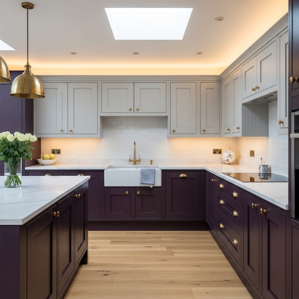
Deep plum lower cabinets paired with pearl gray uppers create the most luxurious and unexpectedly sophisticated kitchen color pairing on this entire list. Plum belongs to the growing family of jewel-toned cabinet colors — alongside deep burgundy and forest green — that are emerging as confident alternatives to safe neutrals across USA kitchen design in 2026. The rich depth of plum in the lower cabinets transforms the kitchen into a genuinely dramatic space that feels curated and deeply personal.
Pearl gray upper cabinets provide the perfect visual relief above the moody plum lower zone without introducing a competing color into the design. Pearl gray’s slight warm-cool neutrality allows it to sit harmoniously above almost any jewel tone below it, making it one of the most versatile upper cabinet colors for pairing with bold, saturated lower cabinet choices. That’s why many kitchen designers keep pearl gray in their top three upper cabinet color recommendations for clients who want bold lowers without losing brightness above.
- Deep plum lowers create jewel-toned kitchen drama
- Pearl gray uppers provide perfect visual relief
- Brushed gold hardware suits plum tones beautifully
- White quartz keeps countertops clean and bright
- Perfect for moody, luxurious kitchen styling
Brushed gold hardware on both the plum lower and pearl gray upper cabinets creates a warm, opulent metallic thread that ties the two colors together with genuine luxury. The warm gold tone amplifies the richness already present in the plum lower cabinets while simultaneously warming the cool-neutral pearl gray above. I’ve noticed that brushed gold is consistently the hardware finish that makes jewel-toned cabinet colors look the most intentional and high-end in completed kitchen renovations.
Pale oak engineered wood floors prevent the dramatic plum lower cabinets from making the kitchen feel cave-like or heavy. The pale wood reflects natural light upward from floor level and keeps the lower half of the kitchen feeling grounded rather than oppressive. A warm recessed lighting setup combined with a single gold pendant above the island fills the kitchen with enough ambient warmth to make the plum look rich and glowing rather than dark and flat.
Coastal Blue and Shiplap White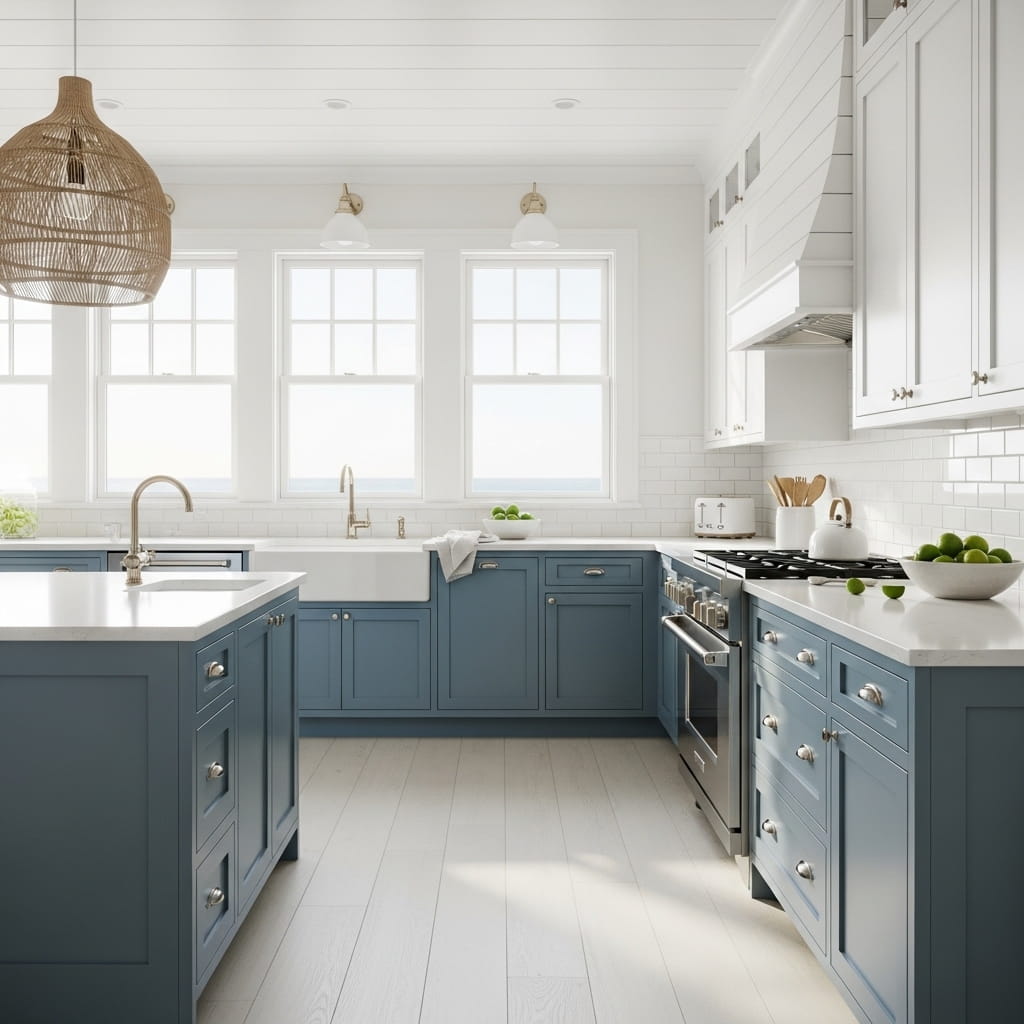
Coastal blue lower cabinets with white shiplap-paneled upper cabinet doors create the most breezy, instantly recognizable Hamptons-style kitchen on this list. The shiplap panel detail on the upper cabinet door faces adds architectural texture that transforms standard flat-front cabinets into a statement feature without any structural renovation work. This specific design approach suits coastal, Hamptons, and relaxed farmhouse kitchen styles with outstanding natural ease.
Medium coastal blue carries the energy of the ocean and open sky into the kitchen environment, making the room feel refreshing and energizing during morning meal preparation. This blue tone is distinct from the deeper navy or slate blue used in other entries on this list — coastal blue has a brighter, lighter quality that suits kitchens with abundant natural light especially well. The lighter the natural light in your kitchen, the more vividly this coastal blue cabinet color performs.
- Coastal blue lowers bring ocean-fresh energy
- Shiplap upper doors add architectural cabinet texture
- Brushed nickel suits coastal and Hamptons aesthetics
- Abundant natural light makes coastal blue sing
- Perfect for Hamptons and relaxed farmhouse kitchens
Woven rattan pendant lights above the island reinforce the natural, coastal material story that the blue cabinets and whitewashed oak floors establish. Rattan and coastal blue belong to the same visual language of natural seaside living, making this pendant light choice feel completely resolved within the overall kitchen design. That’s why many coastal kitchen designers specify rattan or seagrass pendant lighting as their first accessory recommendation for blue-and-white kitchen color palettes.
Whitewashed oak wide plank floors reflect natural morning light beautifully and keep the entire lower half of the kitchen feeling bright and open despite the medium blue cabinet color. The whitewash treatment on the oak removes any yellow warmth from the floor, replacing it with a clean, sun-bleached quality that suits the coastal aesthetic perfectly. White quartz countertops and brushed nickel hardware complete the breezy, light-filled material palette from every angle of the kitchen.
Mocha and Warm Cream
Warm mocha brown lower cabinets paired with soft cream upper cabinets create the coziest, most autumnally rich kitchen atmosphere on this entire list. Mocha is one of the standout emerging cabinet colors for 2026, appearing consistently across USA kitchen trend forecasts as a warmer, more inviting alternative to the cool gray tones that dominated previous years. The warm brown depth of mocha lower cabinets creates an enveloping, cabin-like warmth that makes the kitchen feel genuinely nourishing to be in.
Warm cream upper cabinets connect naturally to the mocha below by sharing the same warm beige undertone family. This shared undertone relationship prevents the two colors from looking like a random pairing and instead makes them feel like two tones of the same warm, earthy color story told across two different depths. I’ve seen this specific mocha-and-cream pairing work exceptionally well in USA kitchens that open directly into a warm-toned living or dining area.
- Mocha lowers create warm, enveloping cabin richness
- Cream uppers share mocha’s warm beige undertone
- Brushed bronze hardware deepens the warm palette
- Cream marble countertops add softly luxurious surface
- Suits autumnal, cozy, and transitional kitchen styles
Brushed bronze hardware deepens the warm brown material story of the mocha lower cabinets and connects the cabinet faces to the warm walnut floors below. The bronze tone sits between the warm brown of the cabinets and the warm orange-brown of the walnut floor, creating a seamless metallic bridge across the warm palette. Cream marble countertops with warm caramel veining add a layer of natural luxury that elevates the mocha and cream cabinet pairing into genuine design sophistication.
A cream handmade ceramic tile backsplash with a slight warm glaze adds artisan texture at the most visually prominent kitchen wall area. The handmade glaze variation creates a soft, shimmering warmth across the backsplash surface that changes beautifully as the kitchen lighting shifts from natural morning light to warm evening ambient. Dried wheat stems in a small vase on the countertop add a final seasonal, organic accent that reinforces every warm autumnal material note in the kitchen.
Light Gray and Warm Walnut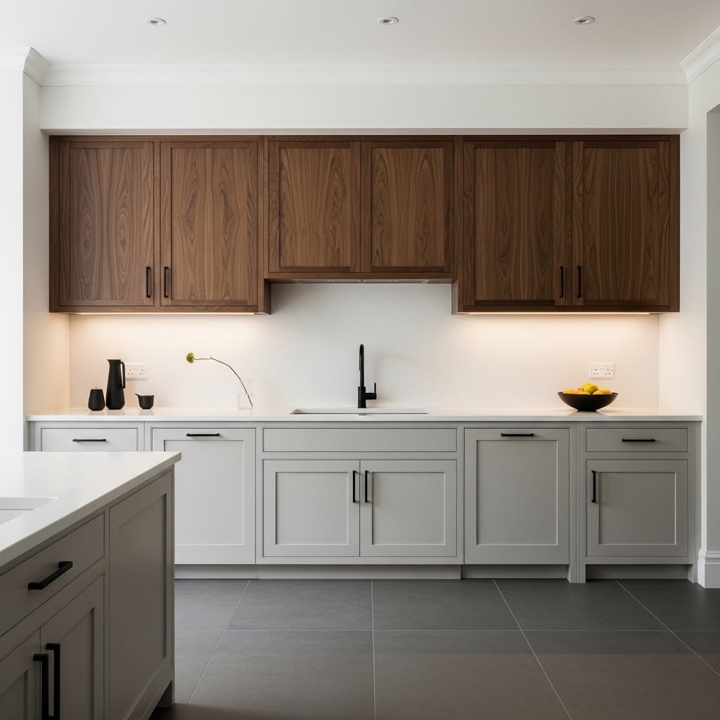
Light warm gray lower cabinets paired with rich dark walnut upper cabinets flip the standard two-tone convention by placing the darker material at the top rather than the bottom. This inverted arrangement creates a dramatically different visual effect — the dark walnut uppers draw the eye upward and create a sense of intimate, overhead warmth that makes the kitchen feel cocooned and architecturally bold. This unconventional kitchen cabinet pairing suits Japandi, contemporary, and dark-modern kitchen styles with remarkable design confidence.
Reversing the typical light-on-top, dark-on-bottom formula gives the kitchen a completely fresh visual logic that immediately signals a sophisticated design point of view. Most kitchens use darker lower cabinets to ground the room visually, but placing dark walnut at the upper level creates an architectural canopy effect that makes the kitchen feel designed from the ceiling downward rather than from the floor up. I’ve seen this inverted two-tone approach consistently generate the strongest reactions from viewers encountering it for the first time.
- Inverted two-tone placement creates architectural boldness
- Dark walnut uppers create a warm overhead canopy
- Light gray lowers keep the base zone clean and open
- Matte black pulls tie dark walnut and gray together
- Suits Japandi, contemporary, and dark modern kitchens
Matte black cabinet pulls on both the gray lower and walnut upper cabinets tie the two very different materials together under a single, clean hardware decision. The matte black hardware belongs naturally to both the cool world of the gray lowers and the warm world of the walnut uppers, making it the most design-intelligent hardware choice for this specific inverted two-tone combination. White stone countertops between the two cabinet zones provide a clean, neutral material transition that prevents the design from feeling too intense.
Large format dark gray porcelain floor tiles echo the gray lower cabinet tone underfoot and create a grounded, steady base for the room. The cool gray floor and cool gray lower cabinets create a light, open lower zone that visually balances the dramatic warmth of the dark walnut above. That balanced tension between cool below and warm above is what gives this inverted two-tone kitchen its distinctive and memorable design quality.
Dusty Sage and Linen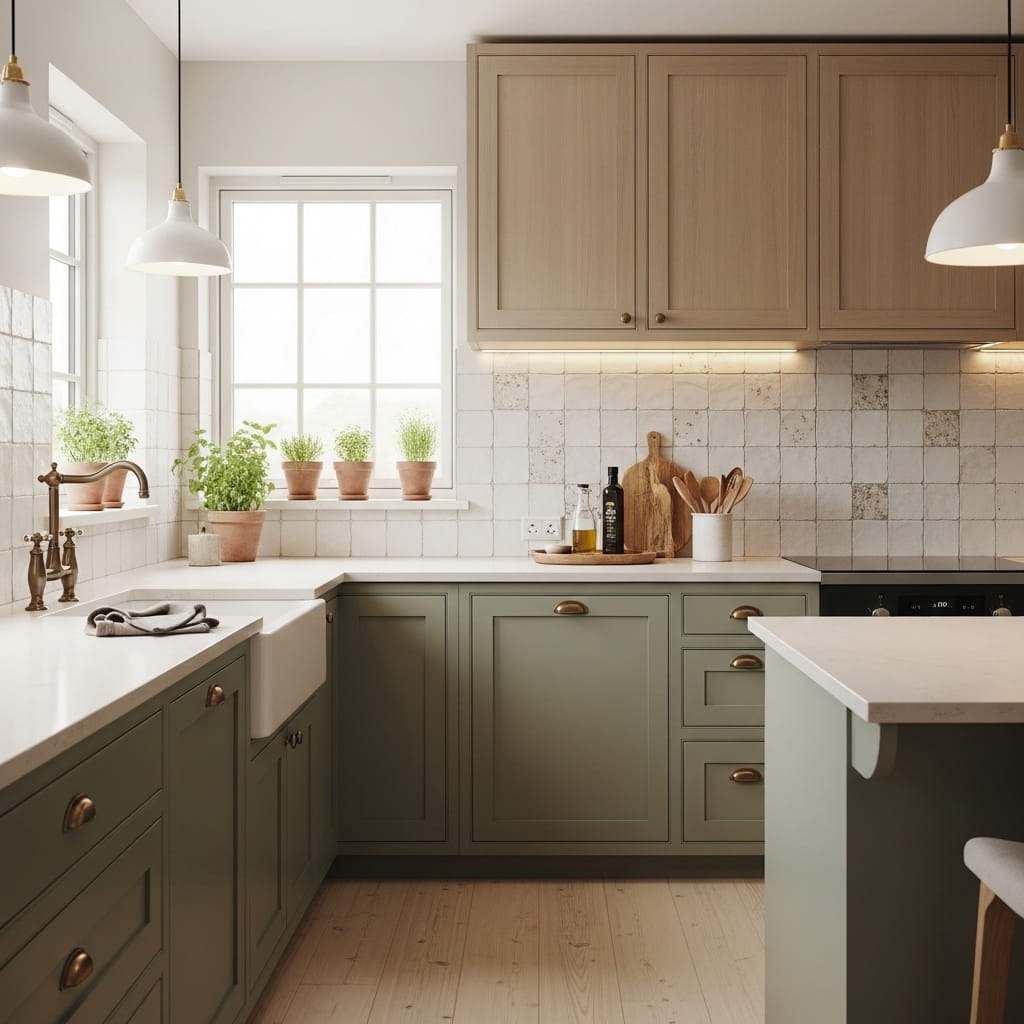
Dusty sage lower cabinets paired with warm linen upper cabinets create one of the most wellness-inspired, organically beautiful kitchen designs in the two tone kitchen cabinets ideas category for 2026. Both colors belong to the same warm, nature-inspired tone family — sage references the botanical world while linen references natural fiber and earth — and their shared warmth creates a deeply harmonious kitchen palette that feels genuinely restful to cook and gather in.
The dusty quality in the sage color is essential to this pairing’s success. A bright, saturated green would clash with the subtle warmth of the linen upper cabinets, but dusty sage’s muted, soft character connects naturally to the quiet warmth of linen without any visual tension. That harmony between two gently muted, warm tones is what makes this specific combination feel so deeply calming and livable as an everyday kitchen environment.
- Dusty sage and linen share warm, muted harmony
- Both tones belong to the nature-inspired color family
- Antique brass hardware amplifies organic kitchen warmth
- Handmade tile backsplash adds artisan, earthy texture
- Perfect for wellness-inspired and organic modern kitchens
Antique brass hardware on both cabinet zones brings a warm, aged-gold quality that suits the organic, botanical character of this kitchen design with complete naturalness. The antique finish adds gentle imperfection to the hardware that complements both the dusty muted green and the warm linen tone without introducing any harshness. Small potted herbs in terracotta pots on the kitchen windowsill add a living botanical element that reinforces the sage green cabinet color in the most authentic and practical way possible.
A white handmade tile backsplash with a natural clay-like texture introduces artisan craft quality into the kitchen wall surface at eye level. The clay-texture tile surface creates a warm, slightly irregular background that suits the organic, unhurried character of the dusty sage and linen palette beautifully. Blonde wood floors complete the organic material story by adding the final natural fiber tone that grounds the entire kitchen in a warm, earthy, and completely cohesive design vision.
Teal and Matte White
Rich teal lower cabinets against clean matte white upper cabinets deliver one of the most vibrant, energy-filled kitchen color combinations on this entire list. Teal occupies a powerful design position at the intersection of blue and green, giving it enough color presence to anchor a kitchen dramatically while still maintaining enough cool-neutral quality to work with a wide range of countertop, flooring, and hardware choices. This bold kitchen cabinet design suits eclectic, vibrant, and maximalist-lite kitchen styles with outstanding visual confidence.
Matte white upper cabinets sit above the teal with a clean, flat finish that prevents any light reflection from competing with the vivid color below. The matte quality in the white uppers keeps the upper cabinet zone quietly neutral so the teal lower cabinets claim full visual ownership of the kitchen’s bold design statement. That’s why many designers specify matte rather than semi-gloss white uppers when pairing them with bold, saturated lower cabinet colors like teal.
- Rich teal lowers create bold, vibrant focal impact
- Matte white uppers keep the upper zone quiet and clean
- Gold grout on white subway tile adds luxury detail
- Brushed gold hardware amplifies teal’s warm undertone
- Suits eclectic and vibrant modern kitchen styling
Gold grout on a standard white subway tile backsplash creates an unexpected luxury detail that elevates the backsplash from a functional surface to a genuine design feature. The gold grout lines catch the warm ambient light and create a subtle shimmering grid behind the cooktop and sink areas. This single material substitution — gold grout replacing standard white grout — adds a design dimension that transforms the entire backsplash aesthetic for minimal additional cost.
A bold geometric patterned rug under the island bar stools adds a playful, maximalist layer to the eclectic kitchen design without requiring any permanent installation. The rug’s geometric pattern can incorporate teal, gold, and white tones to tie every element of the kitchen palette together at floor level. In my experience, a well-chosen kitchen rug is the single fastest and most affordable way to make a bold two-tone kitchen design feel fully resolved and completely intentional.
Warm Terracotta and Slate
Warm terracotta lower cabinets paired with cool slate gray upper cabinets create a deliberately bold color tension that gives this kitchen an exceptional, gallery-worthy visual impact. The warm orange terracotta and the cool blue-gray slate sit on opposite sides of the color temperature spectrum, and that warm-versus-cool tension is precisely what makes this combination so visually dynamic and memorable. This specific two-tone kitchen cabinet design suits Southwestern, eclectic, and bold contemporary kitchen styles with outstanding design conviction.
Using warm and cool colors in deliberate opposition across the upper and lower cabinet zones is an advanced two-tone design technique that delivers far more visual drama than two colors from the same temperature family. The warm terracotta lowers pulse with earthy orange energy while the cool slate uppers provide a visual breathing space above them. That push-and-pull between warmth and coolness creates a kitchen with a deeply intentional, art-directed quality.
- Terracotta and slate create warm-cool color tension
- Opposite color temperatures deliver maximum visual drama
- Matte black hardware grounds both bold cabinet tones
- Geometric patterned tile backsplash adds Southwestern detail
- Perfect for bold, eclectic, and Southwestern kitchens
A hand-painted terracotta tile backsplash with geometric pattern detail at the cooktop wall adds a third layer of Southwestern design character that connects the lower cabinet color to the backsplash surface. The geometric pattern references Native American and Spanish Colonial design traditions that are deeply embedded in Southwestern USA interior design culture. This backsplash choice reinforces the overall design narrative with genuine cultural character rather than simply adding decorative surface interest.
Dark honed black granite countertops bridge the terracotta lower cabinets and the slate gray upper cabinets by sharing color qualities with both — the black absorbs the warmth of the terracotta and the coolness of the slate without taking sides in the color temperature conversation. This neutral-but-dark countertop choice grounds the bold two-tone cabinet palette with serious material weight that the kitchen design demands. Wide plank dark walnut floors complete the rich, earthy material story from floor level upward.
Off-White and Raw Concrete
Off-white lower cabinets paired with raw concrete-look upper cabinet doors create the most architecturally bold and brutalist-modern kitchen design on this entire list. The concrete-veneer finish on the upper cabinet faces introduces a raw, structural material quality that standard painted cabinets simply cannot replicate. This industrial two-tone kitchen cabinet approach suits loft apartments, open-plan industrial spaces, and architectural contemporary homes with outstanding design authority.
Concrete-look cabinet door veneers are one of the most interesting material trends in USA kitchen design for 2026, offering the visual drama of real raw concrete without the structural weight or installation complexity of actual concrete cabinet faces. The matte gray surface has a cool, mineral quality that contrasts strikingly with the warm, soft off-white lower cabinets beneath it. That material contrast — soft paint below, raw mineral above — creates a deeply interesting kitchen design conversation.
- Concrete-veneer uppers add raw architectural drama
- Off-white lowers soften the industrial upper material
- Gunmetal hardware suits the concrete-industrial aesthetic
- Raw concrete slab backsplash extends the industrial story
- Perfect for loft, industrial, and architectural kitchens
Matte gunmetal hardware on both cabinet sections suits the cool industrial aesthetic of the concrete-veneer uppers while keeping the overall hardware palette clean and architectural. The gunmetal finish has a cool, slightly industrial character that belongs naturally to the concrete material family. A raw concrete slab backsplash behind the cooktop and sink extends the concrete material story from the upper cabinet faces onto the wall behind them.
Polished concrete floors below the off-white lower cabinets create a complete concrete material loop — concrete above on the upper cabinet faces, concrete below underfoot — that frames the warm off-white lower cabinets within a structural, mineral material story. The off-white lower cabinets feel almost luminous against this concrete framework, which gives them far more visual presence than they would achieve in a conventional kitchen setting. This is a genuinely bold and design-forward kitchen choice for 2026.
Cream and Deep Burgundy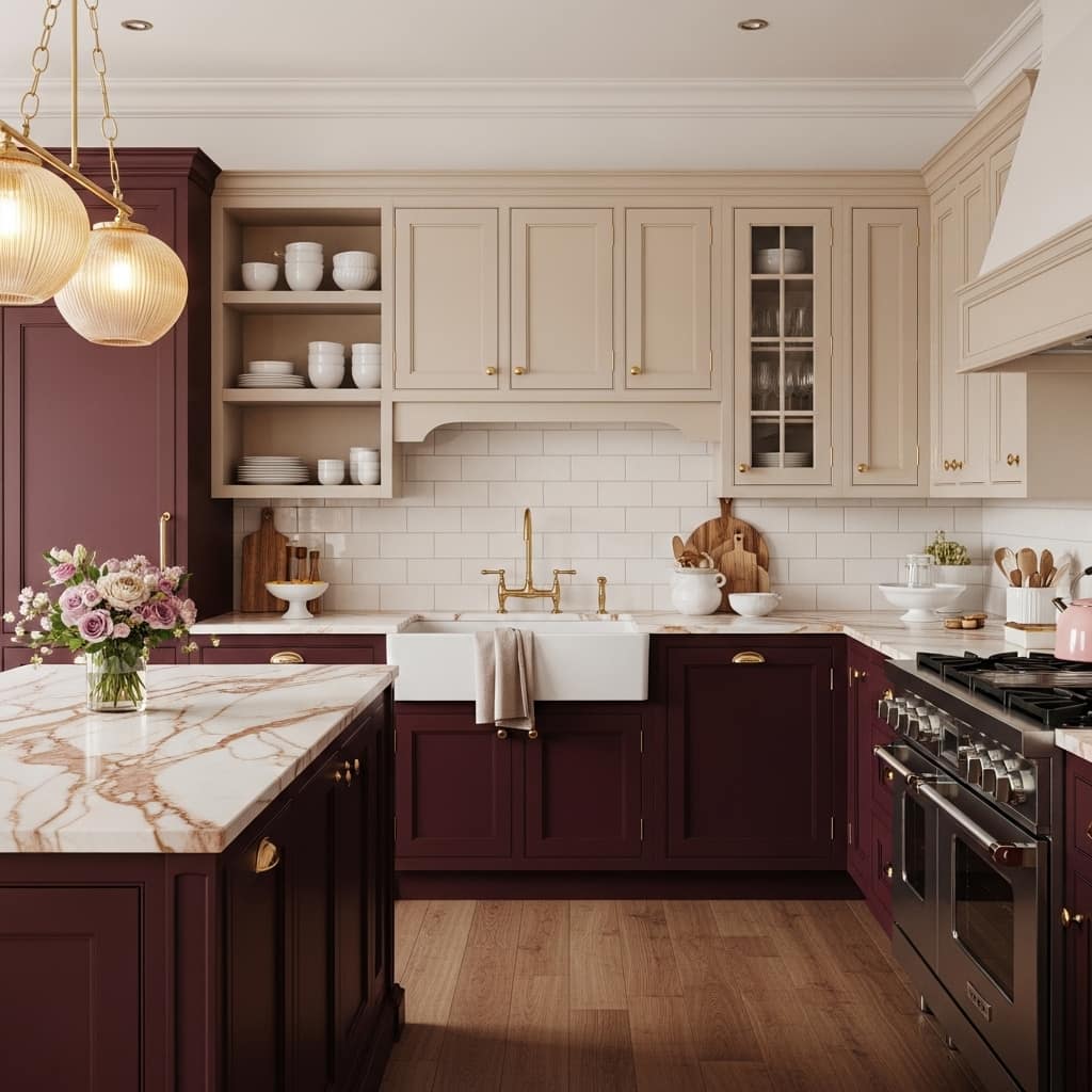
Deep burgundy lower cabinets paired with warm cream upper cabinets create the most romantically rich and opulently beautiful kitchen on this entire list. Burgundy is one of the most exciting rising cabinet colors in 2026, offering a deep, wine-red warmth that feels simultaneously bold and historically rooted in classic European kitchen design traditions. The pairing of dramatic burgundy lowers with quiet cream uppers creates a kitchen that feels both courageous and deeply welcoming simultaneously.
Warm cream upper cabinets sit above the burgundy with a soft, heritage quality that reinforces the romantic, vintage-inspired character of the design. Cream’s slight yellow-beige warmth connects naturally to the red-brown warmth already present in the burgundy lower cabinets, creating a color relationship that feels organically resolved rather than artificially paired. That’s why this specific combination appears increasingly often in USA kitchen renovations that target a maximalist-vintage or romantic-modern aesthetic.
- Deep burgundy lowers create rich wine-red drama
- Warm cream uppers connect to burgundy’s warm undertone
- Rose-veined marble echoes the burgundy cabinet color
- Brushed gold hardware suits romantic kitchen styling
- Perfect for maximalist-vintage and romantic modern kitchens
Cream marble countertops with subtle rose-toned veining create a stunning surface that actively echoes the burgundy cabinet color below it without matching it directly. The pink-rose veining in the marble pulls the rich red-brown of the burgundy upward through the countertop surface, creating a vertical color echo that ties the lower cabinets to the counter material in a beautifully organic way. I’ve seen this specific countertop choice turn an already beautiful kitchen into something genuinely extraordinary.
Open shelving on one upper wall section displays simple white ceramic dishes and a small fresh flower arrangement in a gold vase, adding a layer of collected, personal warmth that prevents the dramatic burgundy-and-cream design from feeling too formal. The open shelf creates a visual breathing space within the upper cabinet run and allows the cream color of the dishes and the shelf surface to reinforce the warm cream tone of the surrounding upper cabinets. This final design detail completes one of the most beautiful two tone kitchen cabinets ideas in this entire collection.
Conclusion
Your kitchen deserves more than a single flat color on every cabinet door. These 28 two tone kitchen cabinets ideas prove that the right color combination — upper against lower, bold against neutral, warm against cool — completely changes how a kitchen looks, feels, and functions as the heart of your home. You do not need a full renovation to see a dramatic result. Pick one color pairing that excites you most and start there. I’ve seen a single cabinet color change turn an ordinary kitchen into the most talked-about room in the house. Save this article on Pinterest, share it with someone planning a kitchen refresh, and take that first bold step today.
Frequently Asked Questions
What is the most popular two tone kitchen cabinet combination in 2026?
Navy lower cabinets with white upper cabinets remain the most requested two-tone pairing in 2026. Sage green island with white perimeter cabinets is a close second. Both combinations suit modern farmhouse and contemporary kitchen styles with outstanding visual confidence and long-term appeal.
Should the darker color go on the upper or lower cabinets?
Dark colors on lower cabinets ground the kitchen and create visual stability. Lighter upper cabinets keep the room feeling open and bright. Most designers recommend darker lowers and lighter uppers for the best visual balance. However, placing dark wood uppers above light lowers creates a bold architectural reversal that works beautifully in Japandi and contemporary kitchens.
What hardware finish works best with two tone kitchen cabinets?
Brushed gold suits warm color pairings like sage green, terracotta, cream, and navy. Matte black suits high-contrast modern pairings like charcoal and white or teal and white. Brushed nickel suits cool neutral pairings like dusty blue and oak or gray and white. Match the hardware finish to the warmer of the two cabinet colors for the most cohesive result.
Can I paint my existing cabinets two tones without replacing them?
Yes, you can paint existing cabinets two tones without replacement. Sand lightly, clean thoroughly, apply a high-quality bonding primer, and use a durable cabinet-specific paint. Many homeowners complete this project for under $300 in materials. A professional cabinet painter delivers the smoothest, most durable finish for long-term results.
How do I choose a countertop for two tone cabinets?
Choose a countertop that contains undertones from both cabinet colors. A marble with gray veining bridges white and charcoal beautifully. A quartz with warm cream tones bridges taupe and antique white naturally. Avoid countertop colors that clash with both cabinet tones simultaneously. The countertop should feel like a natural transition between the two cabinet colors, not a third competing color.
Does a two tone kitchen increase home resale value?
A well-executed two-tone kitchen cabinet design can positively influence buyer perception during home sales. Kitchens with updated cabinet colors consistently rank among the top features buyers notice and value. Neutral-leaning two-tone combinations — such as navy and white or gray and oak — appeal to the widest range of potential buyers and provide the strongest return on a cabinet painting investment.
How do I make a small kitchen work with two tone cabinets?
Use a light color on the upper cabinets to maintain brightness and visual height. Choose a soft, mid-tone color for the lower cabinets rather than a very dark shade. Consider painting only the island in a contrasting color and keeping all perimeter cabinets the same light tone. This single-island contrast approach delivers a two-tone result without making a small kitchen feel cramped or visually heavy.