31 Small Space Wall Decor Ideas That Work 2026
Your walls are doing nothing — and that is costing your home its entire personality. A small room does not need more furniture. It needs smarter, more intentional wall decor that pulls the whole space together beautifully.
Wall decor for small spaces is one of the most searched home styling topics in 2026, and for good reason. Millions of apartment dwellers, renters, and first-time homeowners are sitting inside compact rooms that feel bare, uninspired, and visually unfinished. The walls stay blank for months because choosing the wrong piece feels risky. I’ve noticed that most people overthink the wall and underspend on it, then overspend on furniture that cannot fix the real problem. A styled wall changes how a room feels within minutes.
This article covers 31 specific, practical, and visually inspiring ideas for decorating small walls on any budget. Each idea works in real apartments, compact bedrooms, narrow hallways, and tiny living rooms across the USA. Interior stylists and experienced home decorators consistently point to wall styling as the single highest-impact decorating move in any small space. You will find ideas here that cost under $15 and ideas that look like a professional interior designer executed them. Read every idea, pick your favorite three, and start this weekend.
Single Statement Canvas
A single oversized canvas on a bare wall instantly changes a room’s entire energy. I’ve seen this work beautifully in narrow apartments where multiple small frames created visual clutter instead of charm. One bold piece gives the eye a clear destination. It makes a compact living room feel curated, confident, and surprisingly spacious.
Choosing a canvas in neutral tones or soft abstract shapes keeps the look open and light. That’s why many stylists recommend going larger than you think feels comfortable. A 24×36 inch print above a sofa reads as intentional, not overwhelming. The trick lies in leaving breathing room around the artwork so the wall still feels clean and calm.
- Adds a strong visual focal point
- Reduces small-room visual clutter
- Works well in rental-friendly spaces
- Creates an airy, gallery-style feel
- Pairs beautifully with neutral accent decor
Mounting the canvas at eye level keeps the composition grounded and balanced. Avoid pushing it too high toward the ceiling. I’ve noticed that a gap of 6 to 8 inches above furniture looks best in most compact rooms. The right height ties the artwork directly to the furniture below it.
Natural wood frames or frameless gallery wraps work well in tight wall spaces. Frameless options look especially clean because they remove the visual border that can make small walls feel boxed in. In my experience, a frameless canvas in warm ivory or soft terracotta adds serious warmth without shrinking the room visually.
Vertical Gallery Wall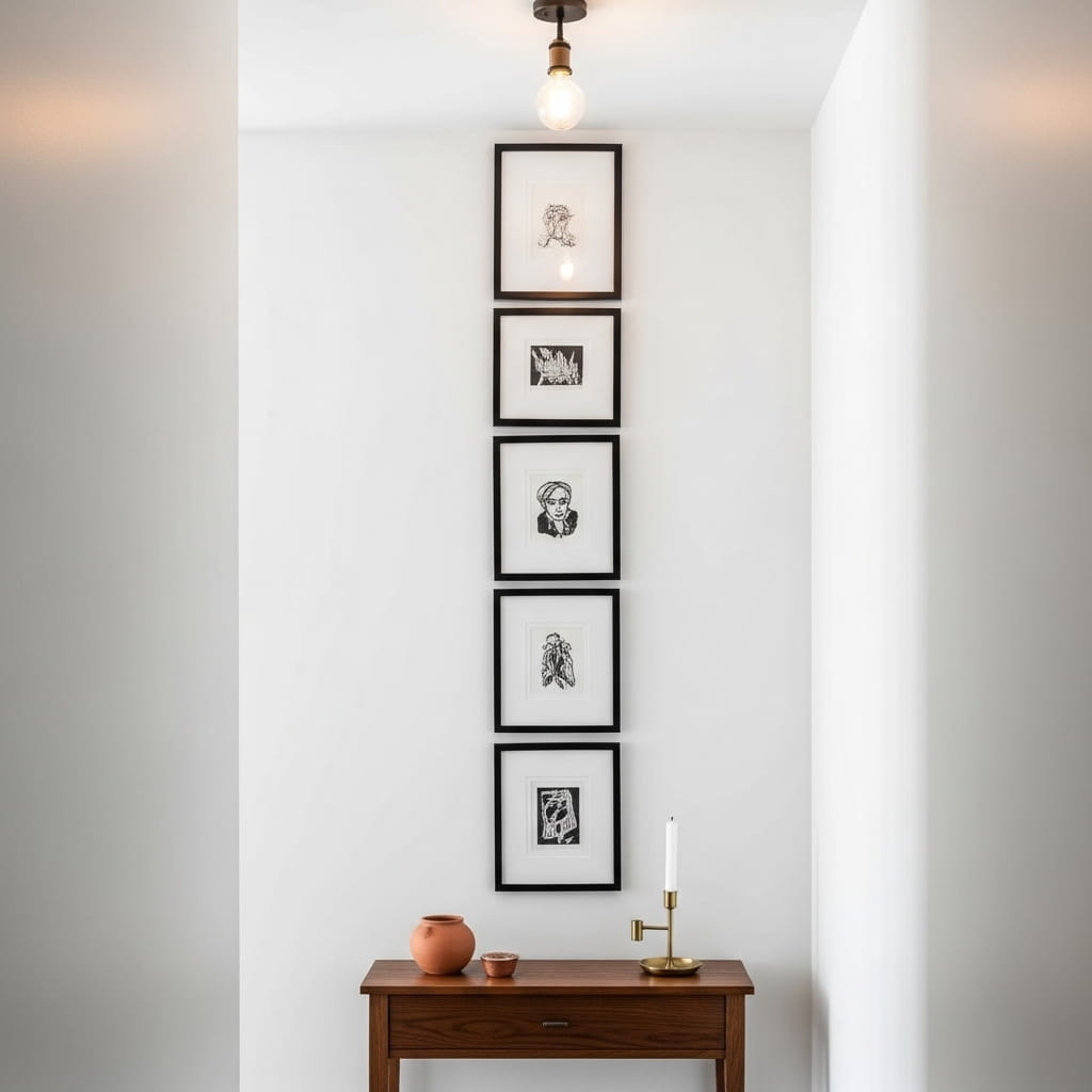
Vertical gallery arrangements draw the eye upward and make low ceilings feel dramatically taller. This is one of the smartest small-space wall tricks designers use in compact hallways and narrow bedrooms. Stacking 3 to 4 frames in a clean column creates structure without spreading wide across a limited wall. The result feels intentional, polished, and very Pinterest-worthy.
Choosing frames in one consistent finish, like matte black or warm brass, keeps the vertical stack looking unified. In my experience, mixing frame sizes slightly, like alternating 8×10 and 5×7, adds visual rhythm without creating chaos. The prints themselves can vary in subject as long as the color palette connects each piece back to the room’s base tones.
- Draws the eye upward naturally
- Works in narrow hallway wall decor
- Creates height in low-ceiling rooms
- Looks clean with matching frame finishes
- Easy to update with seasonal prints
Tight spacing between frames, about 2 to 3 inches, makes the column feel deliberate and gallery-inspired. Wider gaps make the arrangement look accidental. I’ve tried both approaches and the tighter version consistently photographs better and looks more professionally styled in real rooms. Precision here makes a noticeable difference in the final look.
Use affordable art print downloads to fill these frames without a large budget. Many interior designers style entire entryways using $5 digital prints in quality frames. The frames do most of the visual heavy lifting. Investing $15 to $25 per frame dramatically upgrades the look compared to cheap plastic alternatives.
Floating Wood Shelves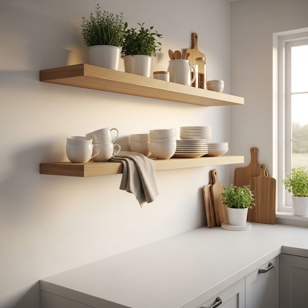
Floating shelves do double duty — they store items and decorate the wall at the same time. This idea works especially well in kitchens, bathrooms, and small living rooms where surface space is always limited. I’ve noticed that two staggered shelves styled with a mix of functional and decorative items look far more interesting than one long shelf loaded with objects. The varying heights create movement and visual depth.
The secret to styled floating shelves is the rule of three. Group items in odd numbers for the most natural, balanced look. Use one taller item, one medium piece, and one low accent on each shelf section. That’s why many interior stylists recommend mixing a small plant, a ceramic vessel, and a book or candle together. The combination hits every visual layer and feels effortlessly curated.
- Adds storage to blank walls
- Creates styled vertical interest
- Works in small kitchen wall decor
- Mixes functional and decorative items
- Affordable rental-friendly wall solution
Natural wood shelves in oak or walnut tones add warmth to white or neutral walls. The contrast between the light wall and dark wood creates definition without adding visual weight. In a small apartment especially, warm wood tones prevent the space from feeling cold, sterile, or too minimal. The texture breaks up a flat wall beautifully.
Installing shelves at two different heights rather than side by side gives the wall a layered, organic feel. Most people mount both shelves at the same level, but staggering them adds personality and flow. I’ve seen this setup work beautifully in compact dining areas where one shelf holds glassware and the other holds a trailing pothos plant.
Arch Mirror Accent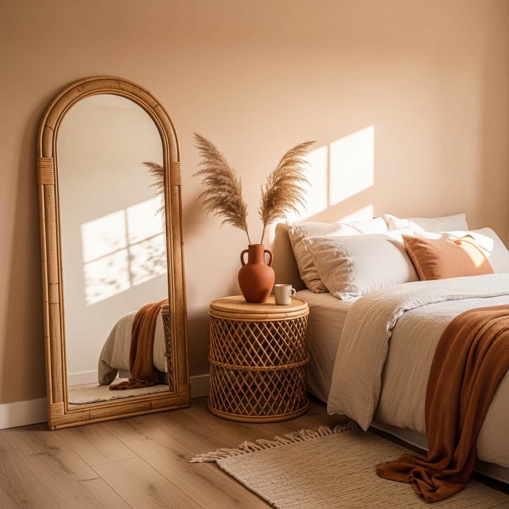
An arched mirror on a small bedroom wall creates the illusion of a doorway and doubles the room’s perceived depth instantly. Mirrors are one of the most effective decorating tools in compact spaces because they reflect light and visually push walls further apart. I’ve tried both round and arched styles, and the arched shape consistently adds more architectural interest in small bedrooms. The curved top softens the room and adds an organic, grounded feeling.
Leaning the mirror against the wall instead of mounting it creates a casual, lived-in look that works especially well in boho and Japandi-styled rooms. This approach also makes it renter-friendly since no drilling is needed. Pairing the mirror with a small plant or ceramic vase beside it anchors the vignette and prevents the mirror from looking like it was just dropped against the wall randomly.
- Reflects light across tight rooms
- Creates depth in compact bedrooms
- Renter-friendly leaning placement option
- Adds an architectural arched focal point
- Works beautifully in boho small spaces
Rattan or natural wood frames add texture and warmth to the mirror’s silhouette. A plain frameless mirror in a small room can feel cold and unfinished. The frame ties the piece into the room’s material palette and makes it feel like a deliberate decor choice rather than a purely functional item. Warm-toned frames photograph exceptionally well in natural light.
Placing the arch mirror beside a window maximizes its light-bouncing effect. The natural light hits the glass and spreads across the room, making it feel significantly brighter. That’s why many interior designers position mirrors on walls adjacent to windows rather than directly opposite them. The angled reflection distributes light more evenly throughout a small space.
Peel and Stick Wallpaper Panel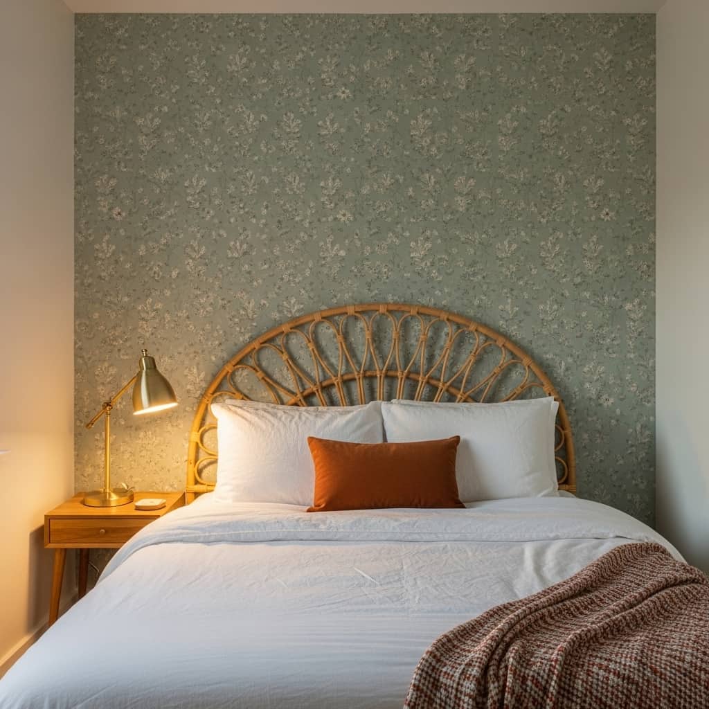
One peel-and-stick wallpaper panel on a single wall creates a full accent feature without covering the whole room. This idea works brilliantly in small bedrooms where a traditional wallpaper project feels too costly or permanent. In my experience, a 6-foot-wide panel centered behind the bed immediately transforms the room’s visual anchor point. It makes the bedroom feel designed and intentional rather than simply furnished.
Choosing a botanical or soft geometric print in muted tones keeps the accent wall from overpowering a small room. Bold, high-contrast patterns can make tight spaces feel even smaller. Sage green, warm terracotta, dusty blue, and soft cream patterns perform especially well in compact rooms. These shades complement natural wood and linen textures without competing for visual attention.
- No-damage installation, renter-friendly
- Creates an instant bedroom accent wall
- Adds pattern to small wall decor ideas
- Easy to remove and replace seasonally
- Pairs beautifully with natural material furniture
Peel-and-stick panels today look nearly identical to professionally installed wallpaper when applied carefully. The key is starting with a clean, smooth, dust-free wall surface. Many brands now offer repositionable versions that you can peel off and reposition if the alignment shifts during installation. This makes the process accessible even for first-time decorators with zero wallpaper experience.
Pairing the textured wallpaper panel with simple solid-colored bedding creates a clean visual balance. Let the wallpaper be the star and keep everything else calm. A white linen duvet and one or two earth-toned throw pillows complement the panel without competing with it. The bedroom instantly earns a hotel-quality aesthetic at a fraction of the renovation cost.
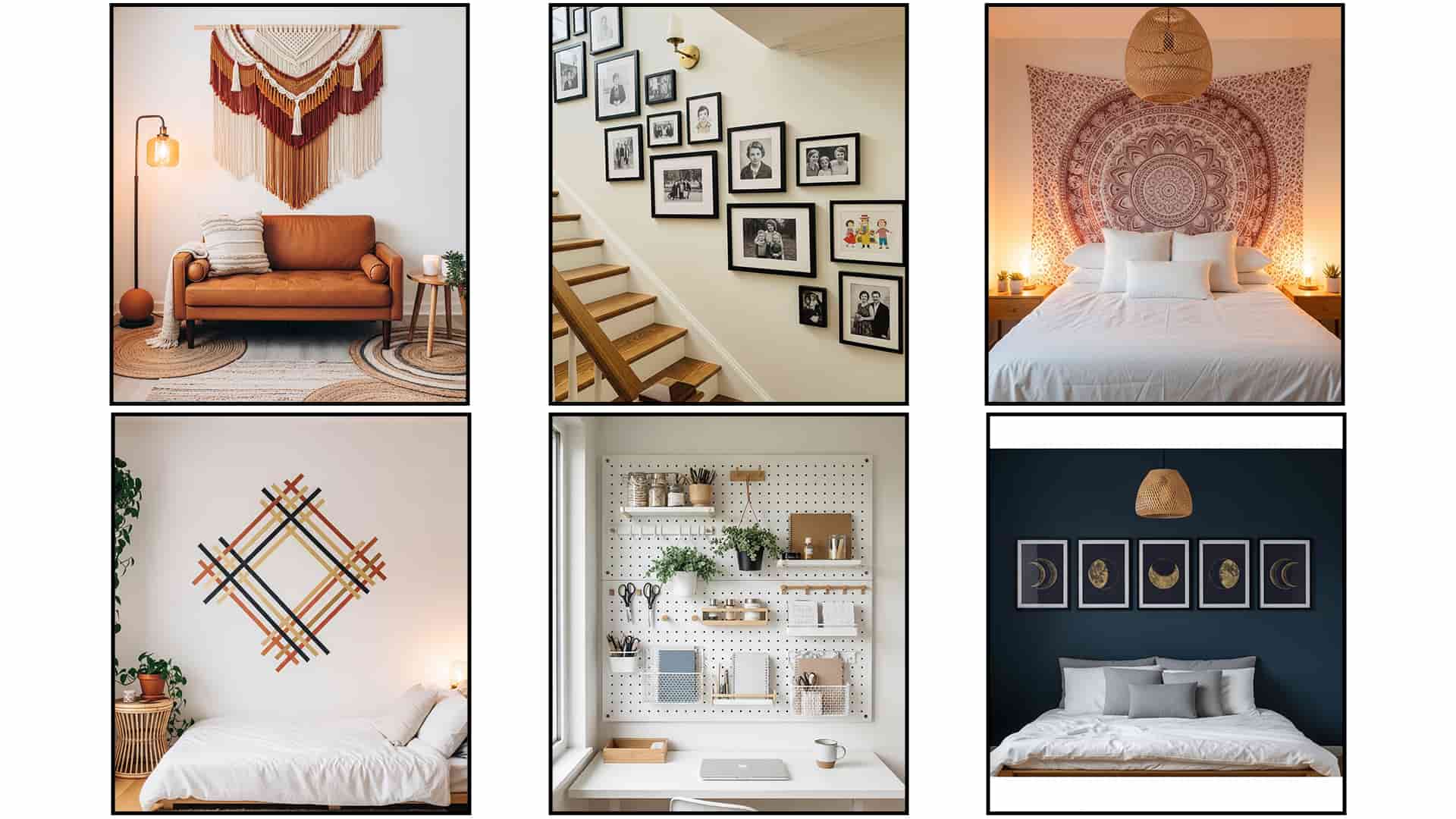
Woven Wall Hanging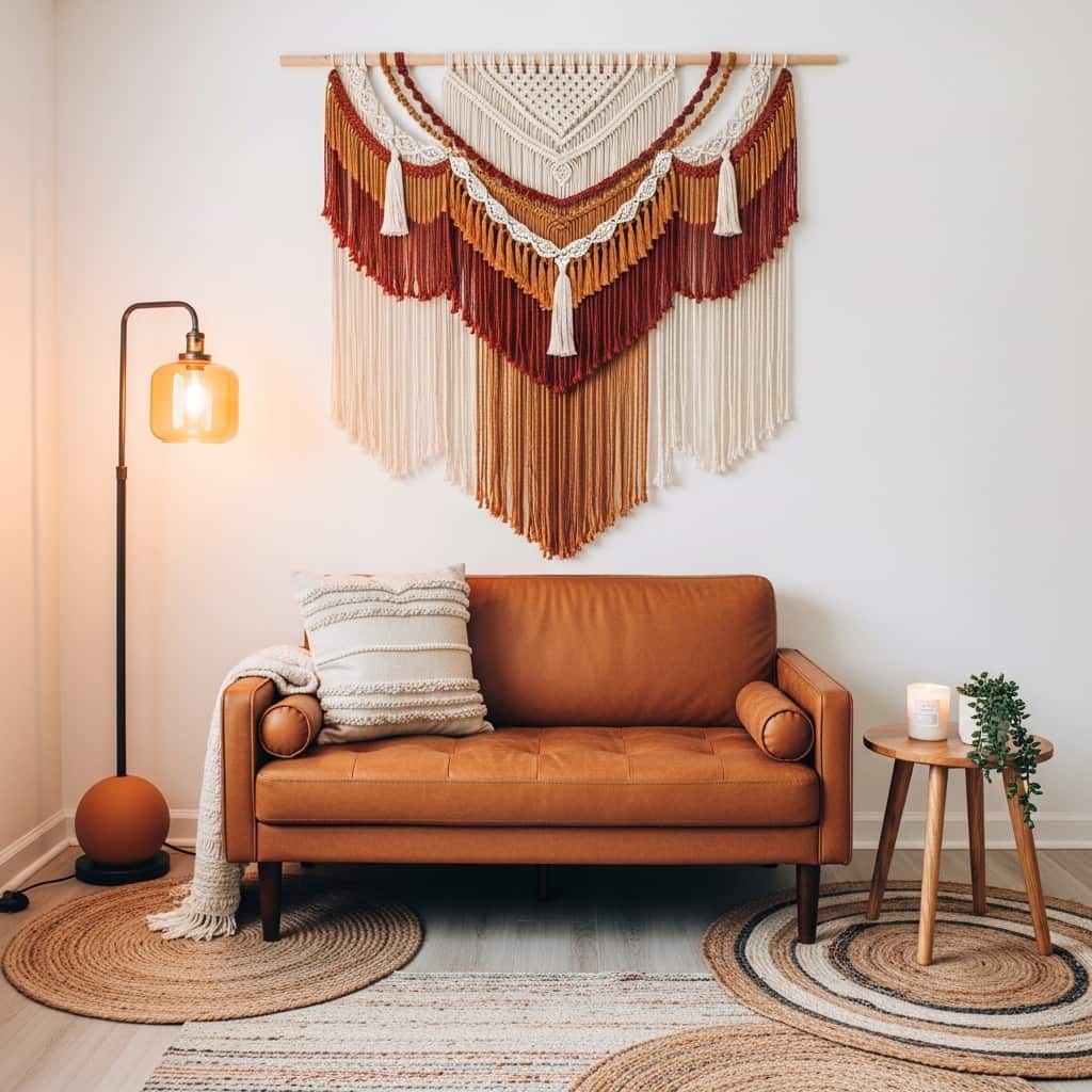
A woven wall hanging adds immediate texture and warmth to a flat, empty wall in any small living space. Unlike framed art, a macramé or woven textile piece brings a tactile, handmade quality that photography and digital prints simply cannot match. I’ve seen even the most minimal apartments feel dramatically cozier once a large woven hanging goes up above the sofa. The fringe detail catches light and creates gentle visual movement.
Choosing a woven piece in warm neutral tones, like cream, rust, and caramel, allows the hanging to complement most furniture colors without clashing. These natural tones work especially well in boho, Japandi, and earthy modern interiors. The organic irregularity of a hand-woven textile also means no two pieces look exactly alike, which adds an authentic, personal quality to the wall display.
- Adds rich texture to bare walls
- Creates a cozy, handmade aesthetic
- Works above sofas in small living rooms
- No frame or nail required for most styles
- Pairs beautifully with warm earthy tones
Sizing matters more than most people expect with woven wall hangings. A piece that spans at least two-thirds of the sofa’s width anchors the living room wall properly. Going too small makes the hanging look lost on the wall. In my experience, most people choose pieces that are too tiny and then wonder why the arrangement feels unfinished and out of proportion with the room.
Hanging the piece at eye level, with the top of the hanging roughly 8 to 10 inches above the sofa back, creates the most balanced composition. Mount it using a simple wooden dowel or a sturdy single nail depending on the design. Many woven hangings include a looped cord at the top for easy hanging, making this one of the most beginner-friendly small wall decor upgrades available.
Ledge Shelf Picture Rail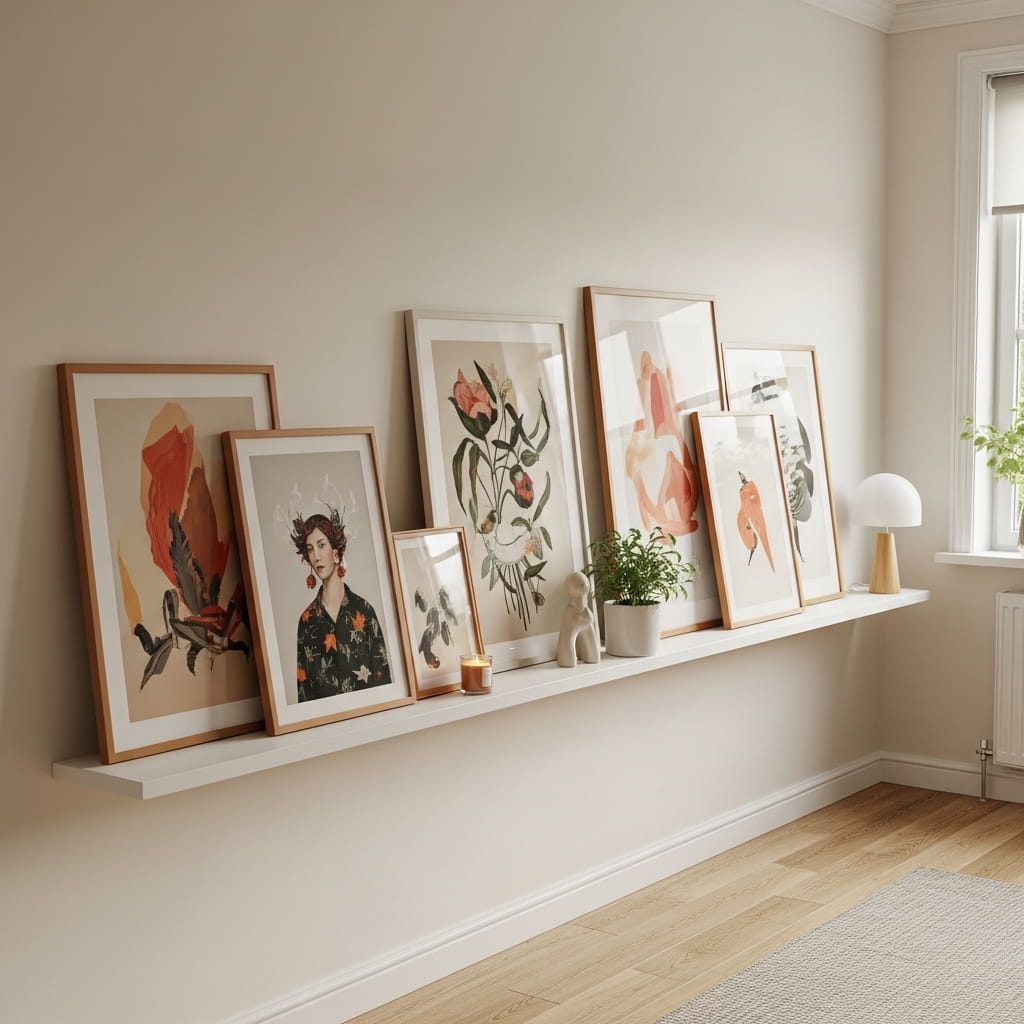
A picture ledge shelf lets you arrange and rearrange prints without ever putting another nail in the wall. This is one of the most flexible small wall decor solutions because the entire display can change in minutes. I’ve used ledge shelves in three different apartments and they are consistently the easiest way to keep wall decor fresh and season-appropriate. You simply swap prints forward, tuck others behind, and the whole look shifts.
Leaning prints at slightly different heights on the ledge creates a layered, organic display that looks far more interesting than rigidly hung frames. Mixing a few different frame widths and finishes within the same warm color family, like gold, walnut, and white, gives the arrangement depth without chaos. That’s why many interior stylists recommend the picture ledge as their first suggestion for renters and first-time decorators.
- Swap prints without new nail holes
- Creates a layered, gallery-style display
- Perfect for rental-friendly wall solutions
- Mix frame sizes for visual rhythm
- Easy seasonal print updates year-round
IKEA’s MOSSLANDA ledge and similar options from Amazon keep the cost well under $25 for a standard rail. Installing two ledges at staggered heights, one at mid-wall and one slightly above, creates the appearance of a full gallery wall at a fraction of the complexity. The staggered approach also makes small wall space look more architectural and considered.
Anchoring one end of the ledge display with a small potted plant, like a trailing pothos or a compact succulent, softens the arrangement and adds a living element. Plants on picture ledges photograph beautifully and add an organic quality that purely decorative items alone cannot achieve. This simple addition makes the whole vignette feel warm, natural, and genuinely lived-in.
Framed Botanical Prints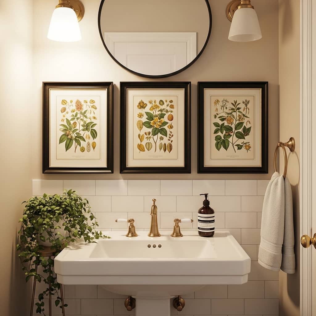
Framed botanical prints bring an organic, timeless quality to small bathrooms and compact hallways that almost no other wall decor replicates as effortlessly. The detailed line-work in classic botanical illustrations adds visual sophistication without requiring bold color or large scale. I’ve noticed that even a set of three 5×7 botanical prints in matching frames completely transforms a bare bathroom wall. The space instantly feels curated and intentional rather than unfinished.
Vintage botanical illustrations work particularly well because they feel both classic and current at the same time. The cream paper background and delicate green line drawings complement white tile, marble, wood, and linen equally well. That’s why many interior designers use botanical prints as their go-to for connecting different design styles within the same home. They are the most versatile print category available for compact room styling.
- Works in small bathroom wall decor
- Adds timeless organic sophistication
- Affordable downloadable print option
- Matches nearly every interior style
- Creates a clean spa-like wall display
Free downloadable botanical prints from sites like Canva or Unsplash make this idea accessible on nearly any budget. Printing a set at a local print shop costs between $3 and $8 per print at 5×7 size. Pairing identical frames in matte black or antique gold keeps the three-piece set looking intentional and cohesive. Matching frames do most of the styling work here.
Hanging the three prints in a tight horizontal line with 2-inch gaps between each frame creates a clean, symmetrical bar of art above the sink. This horizontal arrangement emphasizes the width of the wall and makes a narrow bathroom feel wider and more open. In my experience, this specific layout works better in bathrooms than any other multi-print arrangement because the clean line mirrors the horizontal lines of the tile and fixtures below.
Terracotta Accent Tiles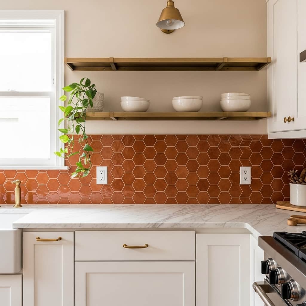
Terracotta tile panels on a kitchen accent wall add rich, Mediterranean warmth that painted walls simply cannot replicate. The textured surface catches light differently throughout the day, creating subtle depth and visual interest in a compact cooking space. I’ve seen this approach turn even the tiniest apartment kitchens into the most photographed rooms in the home. The warm burnt-orange tone makes white cabinets and brass hardware look dramatically more expensive.
Peel-and-stick terracotta tile options have made this look accessible without a full renovation budget. A standard 3×4 foot panel above the counter costs between $40 and $90 depending on the brand. That’s why many budget decorators now treat small kitchen wall decor as their highest-impact investment per square foot in the entire apartment. The return in visual quality far exceeds the cost involved.
- Adds rich texture above countertops
- Creates a warm Mediterranean kitchen vibe
- Works with brass and white cabinet pairings
- Renter-friendly peel-and-stick tile options available
- Photographs beautifully in warm natural light
Pairing terracotta tiles with open wood shelves above creates a layered, artisan kitchen aesthetic. The warm tile background makes every item on the shelf, from white ceramic mugs to small herb pots, look intentionally styled. In my experience, this combination photographs so well that it consistently performs as high-save content on Pinterest home decor boards.
Keeping the tile panel contained to one focused area, rather than covering every kitchen wall, preserves the open feeling in a small cooking space. A single accent zone behind the stove or above the counter reads as a deliberate design feature. Spreading the tile too widely in a tight kitchen risks making the space feel visually heavy and closed in rather than warm and inviting.
Minimalist Line Art Print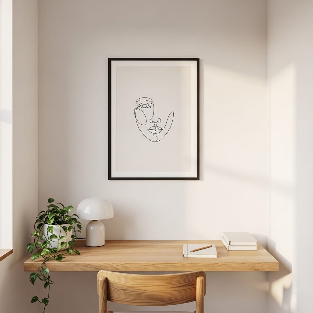
Minimalist line art is one of the most affordable yet visually sophisticated choices for a small home office or bedroom wall. A single continuous-line illustration in a slim frame communicates a refined, artistic sensibility without demanding visual attention from the entire room. I’ve noticed that rooms with one well-chosen line art print feel far more considered than rooms filled with multiple average pieces. The restraint itself becomes the style statement.
Continuous-line portraits and botanical sketches in black ink on cream paper pair effortlessly with nearly every interior color scheme. The near-neutral palette means these prints never clash with existing furniture or wall colors. That’s why many interior designers recommend minimalist line art as the safest, most versatile starting point for anyone styling a compact home workspace or small bedroom wall from scratch.
- Adds sophistication without visual clutter
- Works in small home office wall styling
- Affordable downloadable print option
- Pairs with any wall or furniture color
- Clean look suits modern and Scandi interiors
Digital downloads make minimalist line art one of the most budget-friendly decorating options available today. Sites like Etsy offer high-resolution art files for $3 to $8 per print. You print at home or through a local shop for under $10. Framing the print adds the most cost, but even a $15 to $20 frame from IKEA or Target elevates the entire piece significantly.
Choosing a frame with a wide white mat creates a gallery-quality presentation around smaller prints. A 5×7 line art print inside an 8×10 mat inside an 11×14 frame looks far more polished than a borderless print in a tight frame. The mat adds breathing room around the image and makes the artwork feel valuable and intentional even when the print itself cost almost nothing.
Pegboard Organizer Wall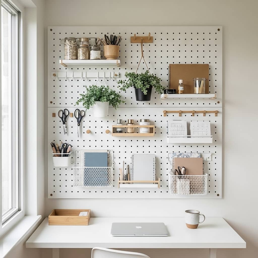
A pegboard wall is one of the most functional and visually dynamic solutions for tight home offices, craft rooms, and small kitchens. It keeps everyday items completely off the desk surface while turning the wall itself into an organized, styled display. I’ve tried this in a small apartment office and the difference in both functionality and visual appeal was immediate. The wall went from blank and forgotten to a genuine focal point of the room.
Painting the pegboard the same color as the wall creates a seamless, built-in look that feels custom and intentional rather than improvised. White pegboard on a white wall nearly disappears while still providing full functionality. That’s why many home organizers and small-space stylists recommend this matching approach for renters who want the look of a styled wall without permanent structural changes to the room.
- Adds function and style to blank walls
- Works perfectly in small office decor
- Keeps desktops clear and organized
- Customizable with hooks, shelves, and plants
- Renter-friendly and easily removable
Adding 2 to 3 small trailing plants in pegboard pot holders brings the wall to life and softens the hard-edged functional look. A pothos, a string of pearls, or a small spider plant cascades down the board and adds an organic quality to what could otherwise look purely utilitarian. In my experience, the combination of organized tools and living plants on a pegboard creates a work-from-home setup that genuinely motivates creativity.
Standard pegboard panels at hardware stores cost between $15 and $30 for a 24×48 inch section. Installing two panels side by side creates a full-wall feature for under $70 including basic hardware. This makes a pegboard one of the highest-value investments per dollar in the small-space decorating category, delivering both organizational function and strong visual impact simultaneously.
Rope Macramé Frame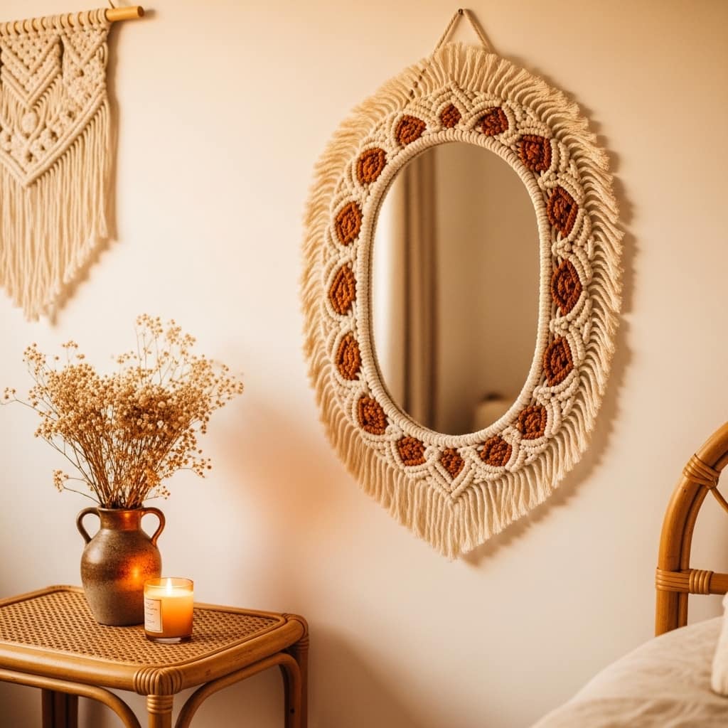
A macramé-framed mirror brings a handcrafted, artisan quality to a small bedroom wall that no mass-produced item can fully replicate. The textured rope border adds dimensional depth around the mirror’s reflective surface, creating a wall piece that reads as both functional and genuinely artistic. I’ve seen this exact style sell out repeatedly on Etsy because it hits the perfect balance between boho warmth and modern simplicity. It suits small bedrooms beautifully.
Oval and round macramé mirrors work especially well in tight spaces because the curved shape softens the hard angles of a small room’s corners and edges. Interior designers often refer to this effect as visual softening, where organic shapes prevent a compact room from feeling boxy or rigid. Hanging a textured macramé piece at eye level on an otherwise empty wall immediately anchors the room’s styling without requiring additional furniture.
- Adds handcrafted texture to bedroom walls
- Softens the sharp angles in tight rooms
- Works as both mirror and wall decor
- Pairs beautifully with rattan and linen
- Natural material suits boho and earthy styles
Sizing the macramé mirror at 18 to 24 inches in diameter works best for small bedroom walls. Larger pieces risk crowding the wall while smaller ones lose their visual impact. The sweet spot at around 20 inches gives the mirror enough presence to anchor the wall without overwhelming the surrounding space or competing with other elements in the room.
Hanging it slightly off-center on a wall, above a rattan side table or a small wooden stool, creates a vignette that looks styled and layered. Pairing the mirror with a single dried flower arrangement and a small candle on the table below builds a complete, Pinterest-ready corner. That’s why this specific setup appears repeatedly on top-performing home decor boards in the boho and natural aesthetic categories.
Painted Arch Mural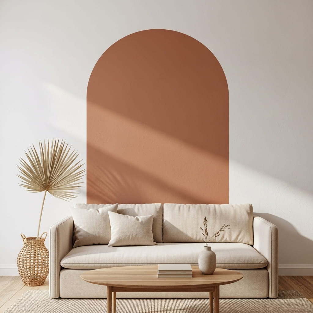
A painted arch directly on the wall is one of the most dramatic yet budget-friendly ways to create a custom focal point in a small living room. The arch shape frames the sofa like an architectural alcove and makes a flat rental wall look like it was designed by an interior architect. I’ve noticed this specific DIY trend performing exceptionally well on home decor Pinterest boards throughout 2025 and into 2026. It costs under $15 in paint and takes about two hours to complete.
Using a muted, earthy tone like terracotta, warm taupe, dusty clay, or soft sage green keeps the painted arch feeling warm and grounded rather than overly bold. The key is choosing a color that is 2 to 3 shades deeper than the existing wall color. This creates a tonal relationship between the arch and the wall that looks sophisticated and intentional rather than random or mismatched.
- Creates an architectural focal point cheaply
- Works above sofas in small living rooms
- DIY-friendly with basic wall paint
- Adds warm depth to flat rental walls
- Pairs beautifully with linen and natural wood
Tracing the arch shape using a large piece of cardboard as a template keeps both sides symmetrical without needing artistic skill. Simply fold the cardboard in half, cut a half-arch curve, unfold, and trace onto the wall using a pencil. Many home decor beginners worry about making this look professional, but a slightly imperfect freehand arch adds character rather than detracting from the overall effect.
Keeping the arch centered directly behind the sofa and sizing it to match the sofa’s width creates the most balanced, intentional composition. An arch that is 6 to 12 inches wider than the sofa on each side looks perfectly proportional. Going significantly wider makes the arch look like it belongs to a different, larger room, while going narrower makes it look accidentally small and underpowered.
Vintage Map Display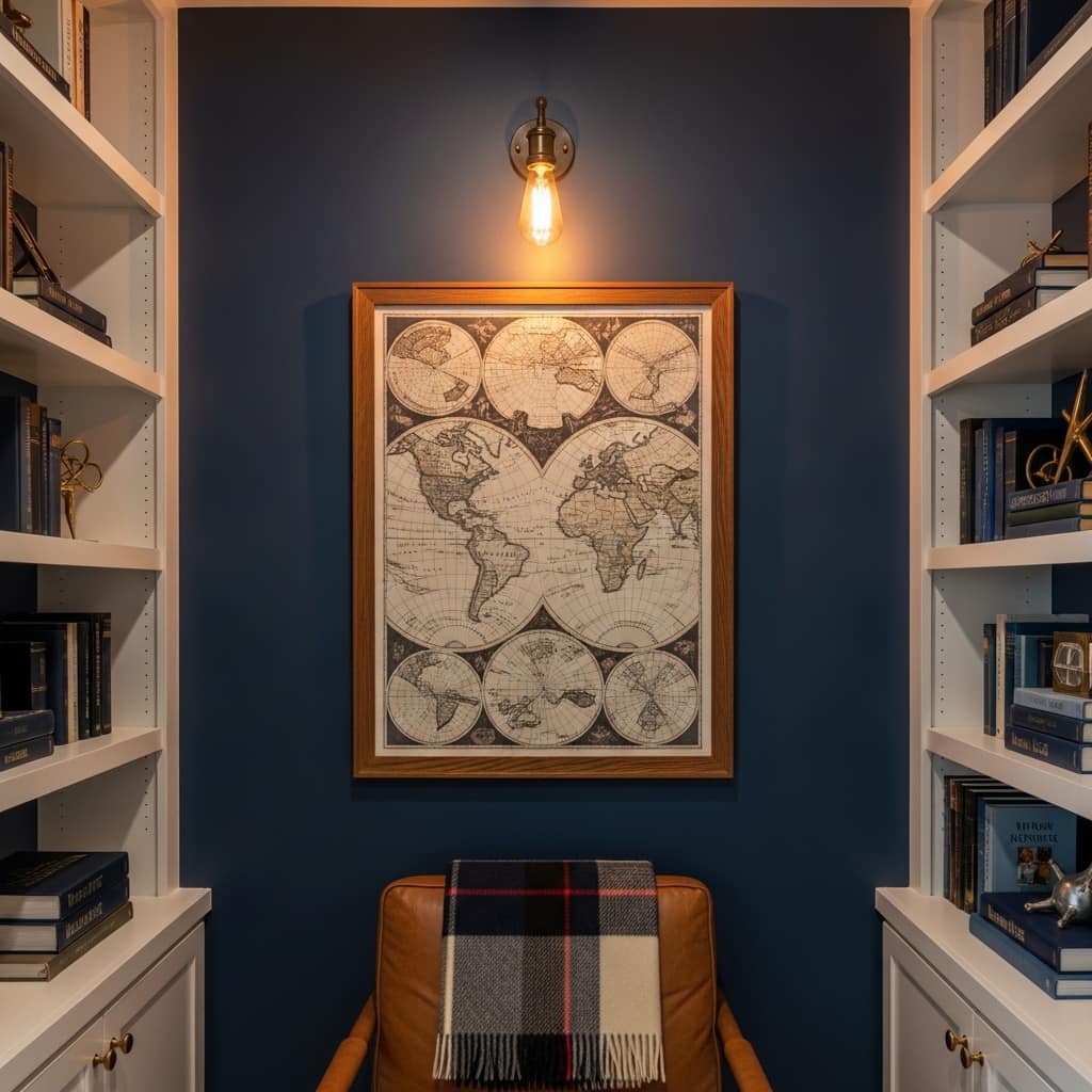
A large vintage map print transforms a small reading nook or home office wall into a space that feels rich with history, curiosity, and personal character. The detailed cartographic artwork provides incredible visual texture — thousands of tiny lines, labels, and geographic details that reward close inspection. I’ve seen this approach work beautifully in dark academic styled rooms where deep navy or forest green walls amplify the vintage map’s warm sepia and gold tones.
Antique-style map prints in warm sepia tones or faded parchment colors work best against deep-colored accent walls. The contrast between a rich wall color and the aged warmth of the map creates a layered, library-like atmosphere. That’s why many dark academic and maximalist interior decorators use vintage maps as their anchor piece when styling a compact home library or a small dedicated reading corner.
- Creates a rich, intellectual focal point
- Works beautifully in dark academic rooms
- Adds historical character to a plain wall
- Suits small home office and nook walls
- Pairs well with leather and warm wood tones
Vintage world maps, city maps, and botanical expedition charts are widely available as high-resolution digital downloads on Etsy for $5 to $12. Printing at 24×36 inch size at a local print shop costs approximately $15 to $25. Combined with a simple wood frame, the total investment stays well under $60 while producing a wall feature that looks custom and genuinely collected over time.
Mounting a brass or antique-finish clip light above the map draws direct attention to the print and creates a small, focused spotlight effect on the wall. This single lighting addition makes the map feel like a museum-quality display piece. In my experience, directed lighting above wall art more than doubles its visual impact in any room, but especially in smaller, more intimate spaces with lower ambient light levels.
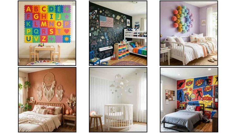
Neon Sign Accent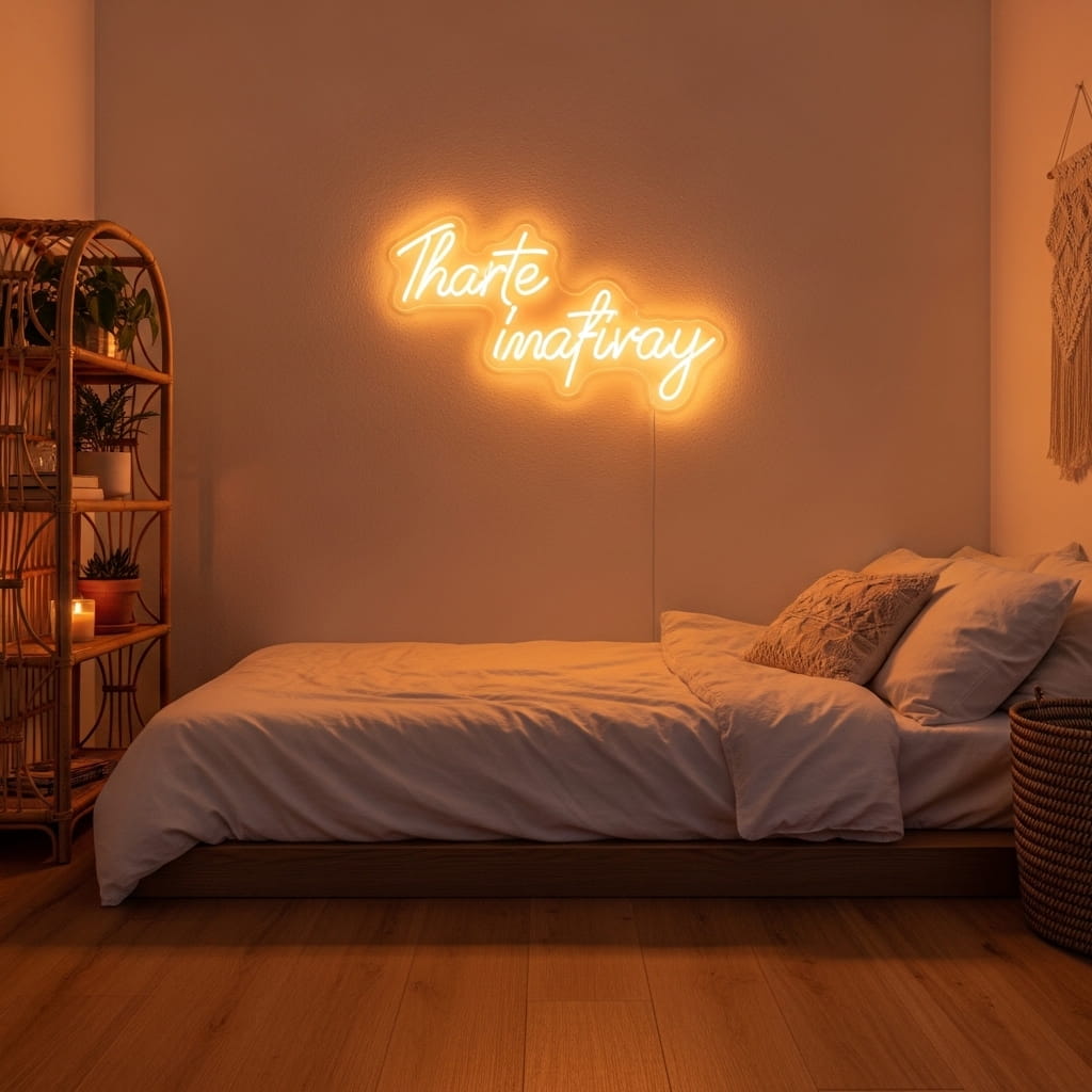
A neon sign on a bedroom wall creates ambient mood lighting and a personal statement piece in one single object. Unlike traditional wall art, a neon sign glows and shifts the entire atmosphere of a small room the moment you turn it on. I’ve seen compact bedrooms go from feeling like plain rental boxes to genuinely styled personal sanctuaries simply by adding a soft warm-script neon above the bed. The light quality alone changes the mood completely.
LED neon signs are far more energy-efficient, durable, and lightweight than traditional glass neon, making them a practical choice for small bedroom walls. A standard 16 to 20 inch LED neon sign uses approximately 10 watts of power compared to 40 to 60 watts for glass neon. That’s why many apartment dwellers and young homeowners are choosing LED neon as their go-to statement piece for personalizing compact rental spaces affordably.
- Creates instant mood lighting in small bedrooms
- Functions as art and ambient light source
- LED options use very little energy
- Personalizes rental walls without paint
- Works beautifully above beds and desks
Short words or simple phrases work best for small bedroom walls. Words like “dream,” “breathe,” “good vibes,” or a first name in cursive script remain legible and stylish at smaller neon sizes. Long phrases lose their visual clarity on tight walls because the sign either shrinks to illegibility or stretches beyond the wall’s available space. A single impactful word always photographs and performs better in small spaces.
Warm white, soft amber, and blush pink glow colors suit the bedroom environment far better than bright green or electric blue tones. The cooler, bolder colors read as energizing rather than calming, which works against the relaxed atmosphere most people want in a sleeping space. In my experience, warm-toned neon signs also photograph more beautifully in evening interior shots, which matters especially for anyone creating Pinterest-optimized home decor content.
Fabric Tapestry Panel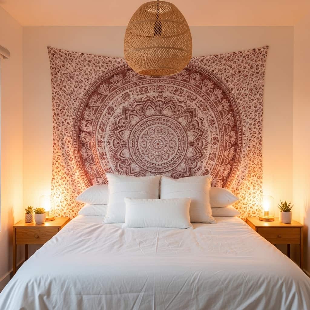
A fabric tapestry behind the bed solves two small-space decorating challenges at once — it fills a large wall quickly and acts as a soft, cost-effective headboard alternative. Tapestries require zero installation skill beyond a single wall nail or curtain rod, making this one of the most beginner-friendly options in the wall decor for small spaces category. I’ve tried this approach in a studio apartment and it visually separated the sleeping area from the rest of the room immediately.
Choosing a muted, tonal tapestry print in dusty rose, terracotta, sage, or soft navy keeps the large-format pattern from overpowering a compact room. High-contrast tapestries with dark backgrounds and bright patterns can shrink a small bedroom visually. A tonal, softly detailed print adds pattern and personality while allowing the surrounding bedding, plants, and furniture to remain visible and balanced within the overall composition.
- Fills large walls quickly and affordably
- Acts as a soft headboard alternative
- Requires minimal installation effort
- Adds boho pattern to small bedroom walls
- Easy to swap for seasonal decor changes
Hanging the tapestry using a decorative wooden dowel and natural cotton cord creates a finished, intentional display rather than a simply tacked-up fabric. The dowel adds a clean top edge and keeps the fabric hanging flat and smooth against the wall. Many tapestry sellers include hanging hardware, but upgrading to a natural wood rod instantly improves the look from dorm-room casual to genuinely styled and purposeful.
Cotton and cotton-blend tapestries hold their color and drape better than synthetic alternatives over time. A 100% cotton tapestry at twin or full size, approximately 60×80 inches, covers the full wall space behind a queen bed without looking undersized. Washing the tapestry gently in cold water every few months keeps the fabric fresh and prevents the pattern colors from fading or yellowing, especially in rooms with strong natural light.
Corner Wall Vignette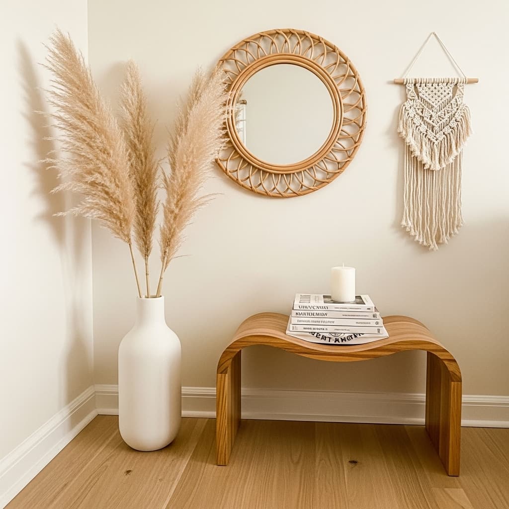
Corner walls are the most underused real estate in almost every small apartment, yet a well-styled corner vignette creates one of the most scroll-stopping home decor moments in the entire room. Instead of leaving a corner bare or pushing a piece of forgotten furniture into it, treating it as a styled wall zone produces a layered, editorial quality that feels both designed and organic. I’ve noticed that a corner vignette with just 3 to 4 elements consistently outperforms full gallery walls in Pinterest saves and engagement.
The most effective corner vignettes use a mix of vertical and horizontal elements to fill the space naturally. A tall item like a floor vase with dried pampas grass, a medium item like a leaning mirror, and a low item like a small stool or stack of books create a visual triangle that guides the eye smoothly from the floor upward. That’s why many interior stylists describe the visual triangle as the foundational rule of vignette styling in compact rooms.
- Uses overlooked corner wall space creatively
- Creates a layered, editorial room vignette
- Requires no wall mounting in most setups
- Combines floor items with wall elements
- Works beautifully in boho and minimal rooms
Limiting the corner vignette to 3 to 5 carefully chosen items prevents the arrangement from tipping into visual clutter. Every item in the vignette should serve either a visual or functional purpose. Decorative items that simply fill space without contributing to the overall composition weaken the look and make the corner feel crowded. Edit ruthlessly and let each piece earn its spot in the arrangement.
Adding a small wall-hung macramé piece or a single framed print directly on the corner wall above the vignette connects the floor arrangement to the wall surface and makes the entire corner feel cohesive and intentional. This vertical connection between the floor elements and the wall art above them is what separates a genuinely styled vignette from a random collection of objects placed near a wall.
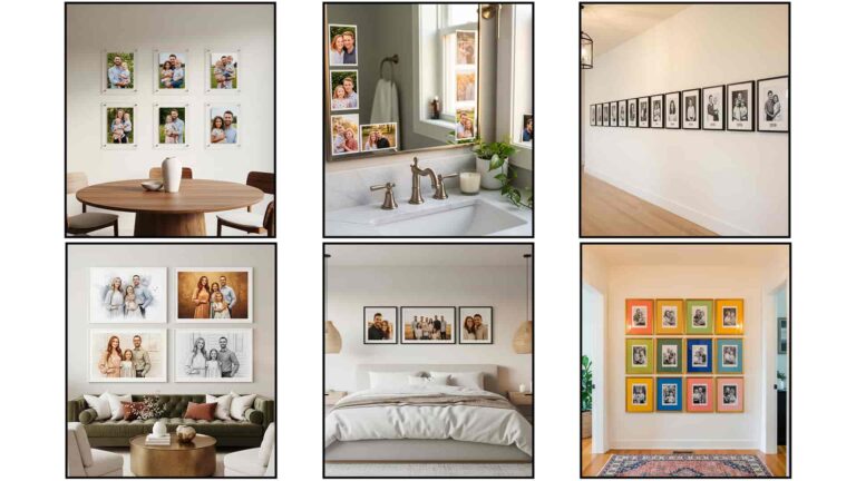
Clustered Small Frames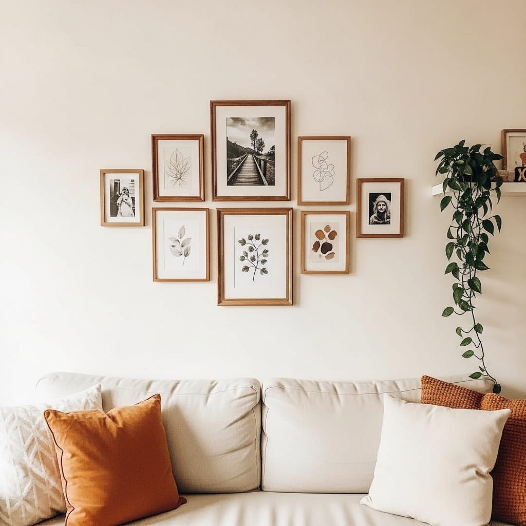
Grouping 6 to 8 small frames tightly together on one wall section creates a rich, editorial gallery moment that feels collected and personal rather than store-bought and generic. The clustered approach works especially well when individual prints are too small to carry visual weight alone. I’ve noticed that the spacing between frames matters enormously here — keeping gaps between 1.5 and 2 inches holds the cluster together as a unified composition rather than a scattered collection of unrelated pieces.
Mixing three types of artwork within the cluster, like black-and-white photography, soft watercolor prints, and minimal line drawings, creates visual variety while keeping the overall palette cohesive. Connecting all frames through one consistent finish, like warm gold or natural walnut, unifies the group even when the content varies widely. That’s why many interior stylists describe the frame finish as the glue that holds a mixed-content gallery wall together visually.
- Groups small prints into one bold statement
- Works beautifully above sofas and console tables
- Mix art types but unify with matching frames
- Adds personal, collected character to plain walls
- Affordable with downloadable print combinations
Planning the layout on the floor before putting a single nail in the wall saves significant time and prevents unnecessary holes. Arrange all frames on the floor first, photograph the arrangement from above, and use that photo as your hanging guide. Most professional gallery wall installers use this exact method regardless of the wall size or frame count involved.
Anchoring the cluster with the largest frame at the center or slightly off-center creates a natural focal point that the smaller frames orbit around. Starting from the center and working outward maintains balance across the full arrangement. In my experience, starting from a corner frame first leads to a composition that drifts and loses its centered, intentional quality before the final frames go up.
Black Accent Wall Panel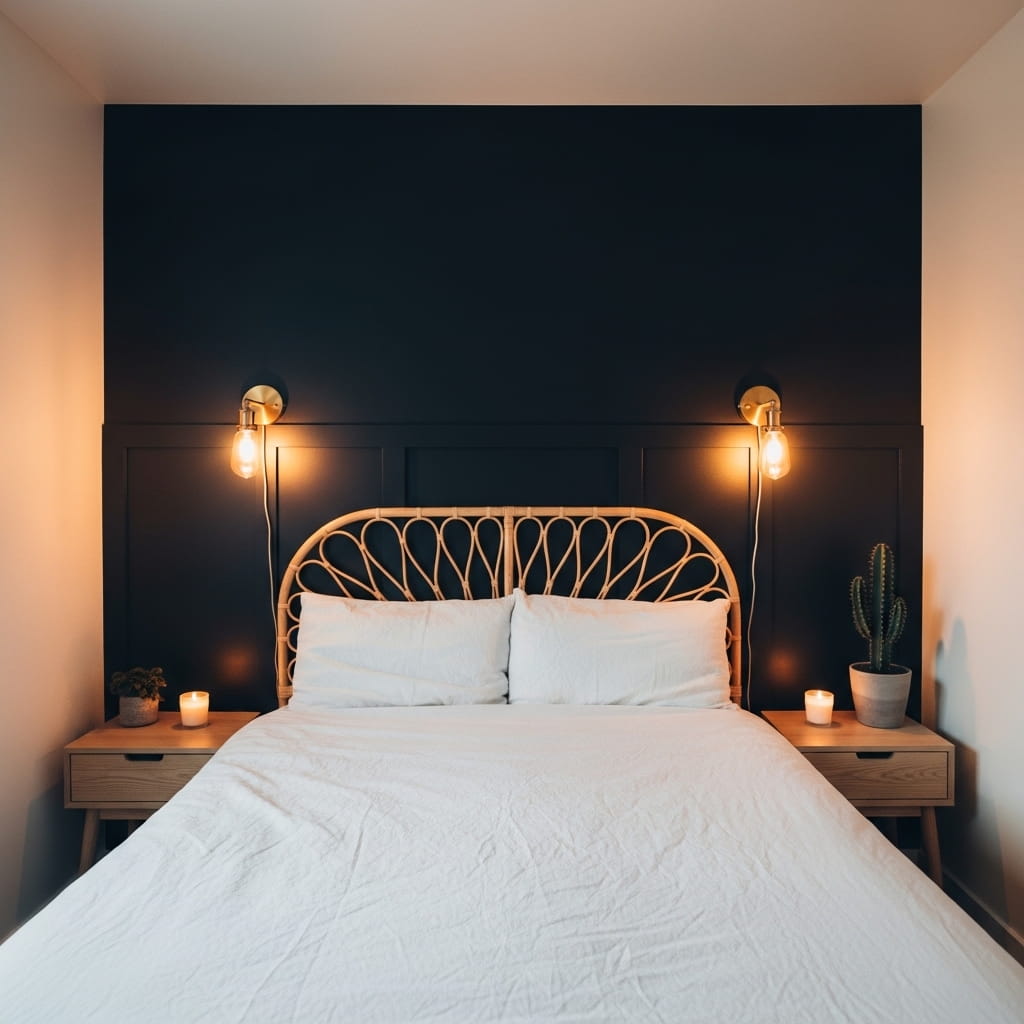
A deep matte black accent panel behind the bed creates a dramatic, high-contrast focal point that makes white or neutral bedding look incredibly crisp and intentional by comparison. This approach suits compact bedrooms particularly well because the dark panel visually recedes, making the wall appear to push back and the room feel deeper than its actual dimensions. I’ve seen this specific combination, matte black wall with white linen and warm brass sconces, consistently rank among the highest-saved bedroom ideas across home decor platforms.
Painting only the wall section directly behind the bed rather than all four walls prevents the small bedroom from feeling closed in or cave-like. A contained accent panel measuring roughly 8 to 10 feet wide, centered on the bed, delivers all the drama of a dark room without sacrificing the airiness the remaining light walls provide. That’s why many interior designers recommend this partial approach for compact bedrooms where a full dark-room treatment would feel oppressive rather than sophisticated.
- Creates dramatic contrast in small bedrooms
- Makes white bedding look sharp and luxurious
- Keeps remaining walls light and airy
- Pairs beautifully with brass and warm lighting
- One-wall DIY paint project, weekend-friendly
Matte finish paint is essential for this look because satin or semi-gloss black reflects overhead light unevenly and creates distracting sheen patches on the wall surface. A flat or matte black finish absorbs light evenly and looks deeply rich without any visual inconsistency. Most quality matte wall paints in black or near-black shades cost between $35 and $55 per gallon, which covers the accent wall completely in two coats.
Adding two symmetrical brass wall sconces directly on the black panel, positioned at eye level on each side of the bed, completes the look with a hotel-quality finish. The warm amber glow of the sconce bulbs against the matte black background creates a deeply cozy atmosphere that overhead ceiling lights simply cannot replicate. This lighting and color pairing is one of the most effective small bedroom styling moves available at a modest budget.
Pressed Flower Shadow Box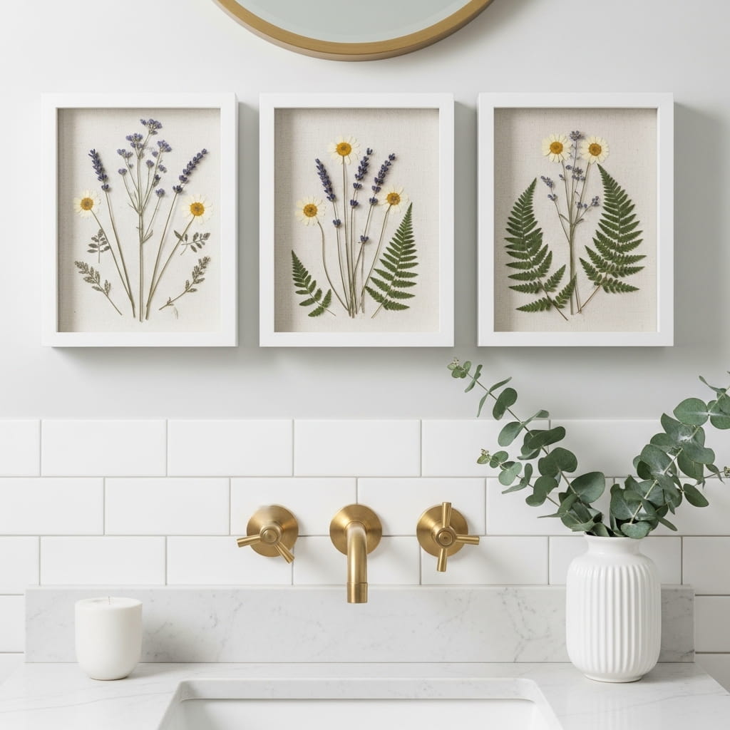
Pressed flower shadow boxes bring a deeply personal, handmade quality to small bathroom or bedroom walls that no printed artwork can fully replicate. Each pressed specimen is unique, and the combination of natural organic material behind glass creates a subtle three-dimensional depth that draws viewers in for a closer look. In my experience, these shadow boxes consistently attract the most genuine compliments from guests because they feel truly one-of-a-kind rather than ordered from a catalog or downloaded from a stock art site.
Pressing flowers at home costs almost nothing beyond a heavy book and two weeks of patience. Wildflowers, garden blooms, eucalyptus sprigs, and fern fronds all press beautifully and retain their color and shape for years when sealed properly behind UV-protective glass. Arranging pressed specimens on a linen or watercolor paper backing before framing creates a layered, botanical illustration quality that looks far more expensive than the actual materials involved.
- Adds a handmade, one-of-a-kind wall piece
- Uses real pressed botanicals for natural texture
- Works beautifully in small bathroom wall decor
- Budget-friendly DIY with minimal materials
- Creates a personal, spa-like wall display
Using deep shadow box frames with at least 1 inch of depth allows thicker stems and layered flower arrangements without crushing against the glass front. Standard flat frames press botanical specimens too tightly and can damage delicate petals over time. Shadow box frames give the arrangement breathing room and allow soft, dimensional arrangements rather than completely flat single-layer compositions.
Mounting three matching white shadow boxes in a tight horizontal row above the vanity creates a clean, spa-inspired wall display that works beautifully in bathrooms of any size. Keeping the boxes at the same height and spacing them exactly 3 inches apart delivers a symmetrical, professional installation result. Adding one small piece of eucalyptus or lavender to a ceramic vase on the counter below the trio ties the wall display directly to the room’s surface styling.
Washi Tape Wall Art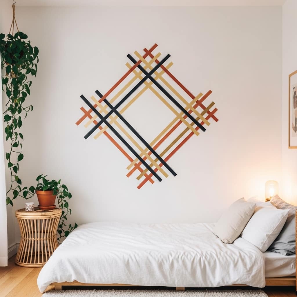
Washi tape wall art lets renters create bold, custom geometric designs on their walls without spending a dollar on paint or risking a single cent of their security deposit. A large diamond grid or abstract line pattern in matte black washi tape above the bed creates a graphic, designer-quality feature wall that looks genuinely intentional and styled. I’ve noticed that washi tape geometric designs photograph beautifully in natural morning light, making them extremely popular content on Pinterest home decor boards for compact rental apartments.
Using three complementary tape colors, like matte black, warm gold, and soft terracotta, creates a richly layered geometric pattern while keeping the overall palette connected and cohesive. Sticking to 2 to 4 tape widths within the same design adds visual complexity without making the pattern look chaotic. Wider tape strips create bold structural lines while thin tape adds delicate detail and secondary geometric shapes within the larger pattern.
- Zero-damage design for rental walls
- Creates a custom geometric feature wall
- Costs under $20 for full wall coverage
- Easy to remove and redesign seasonally
- Bold visual impact above beds and desks
Removing washi tape from painted walls leaves no residue when pulled off slowly at a low angle. Pulling tape quickly or at a sharp upward angle risks lifting small paint chips from older or low-quality wall paint. Testing a small strip in an inconspicuous corner first confirms the wall paint can handle tape removal cleanly. Most standard latex-painted walls handle washi tape removal without any damage at all.
Planning the geometric design on paper before applying tape to the wall prevents misalignment and wasted tape. Simple graph paper sketches showing the grid proportions help translate the design accurately onto the wall. Using a level and small pencil marks as guide points keeps horizontal and diagonal lines straight without freehand guesswork. The entire design process from planning to completion typically takes two to three hours for a standard queen-bed-width wall panel.
Dried Flower Wreath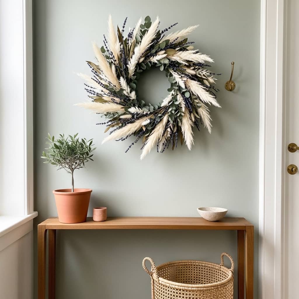
A dried flower wreath on the entryway wall sets the entire mood of a home the moment someone walks through the door. Unlike fresh wreaths that last only a week or two, a well-made dried botanical wreath retains its shape, texture, and subtle fragrance for 12 to 18 months with minimal care. In my experience, guests almost always comment on a dried pampas and eucalyptus wreath first before noticing anything else in the entryway. The natural texture and gentle organic scent create an immediate sensory welcome.
Dried flower wreaths suit small entryway wall decor particularly well because they add significant visual texture and warmth without requiring any shelf space, console surface area, or floor footprint. The wreath hangs flush against the wall on a single nail or adhesive hook and occupies no physical depth in a tight hallway. That’s why minimalist decorators and small apartment dwellers consistently choose dried wreaths over fresh flowers as their primary entryway wall feature.
- Adds instant warmth to small entryway walls
- Lasts 12 to 18 months with minimal care
- Uses no shelf or floor space whatsoever
- Natural scent creates a welcoming atmosphere
- Works with every season’s color palette
Choosing a wreath with a 22 to 26 inch diameter works best above a standard console table in a narrow hallway. A smaller wreath at 14 to 16 inches looks insignificant and underwhelming on most wall heights. Going larger at 28 inches or beyond can overpower a tight entryway wall visually. The 22 to 26 inch range hits the proportional sweet spot for most standard apartment and small home entryway walls.
Hanging the wreath with a natural jute cord looped over the nail creates a more relaxed, organic display than a plain metal hook. The visible cord adds a subtle decorative element above the wreath and prevents the piece from looking rigidly formal or stiffly mounted. Positioning the wreath so its center sits at approximately 57 to 60 inches from the floor places it comfortably at eye level for most adults entering the space.
Reclaimed Wood Plank Wall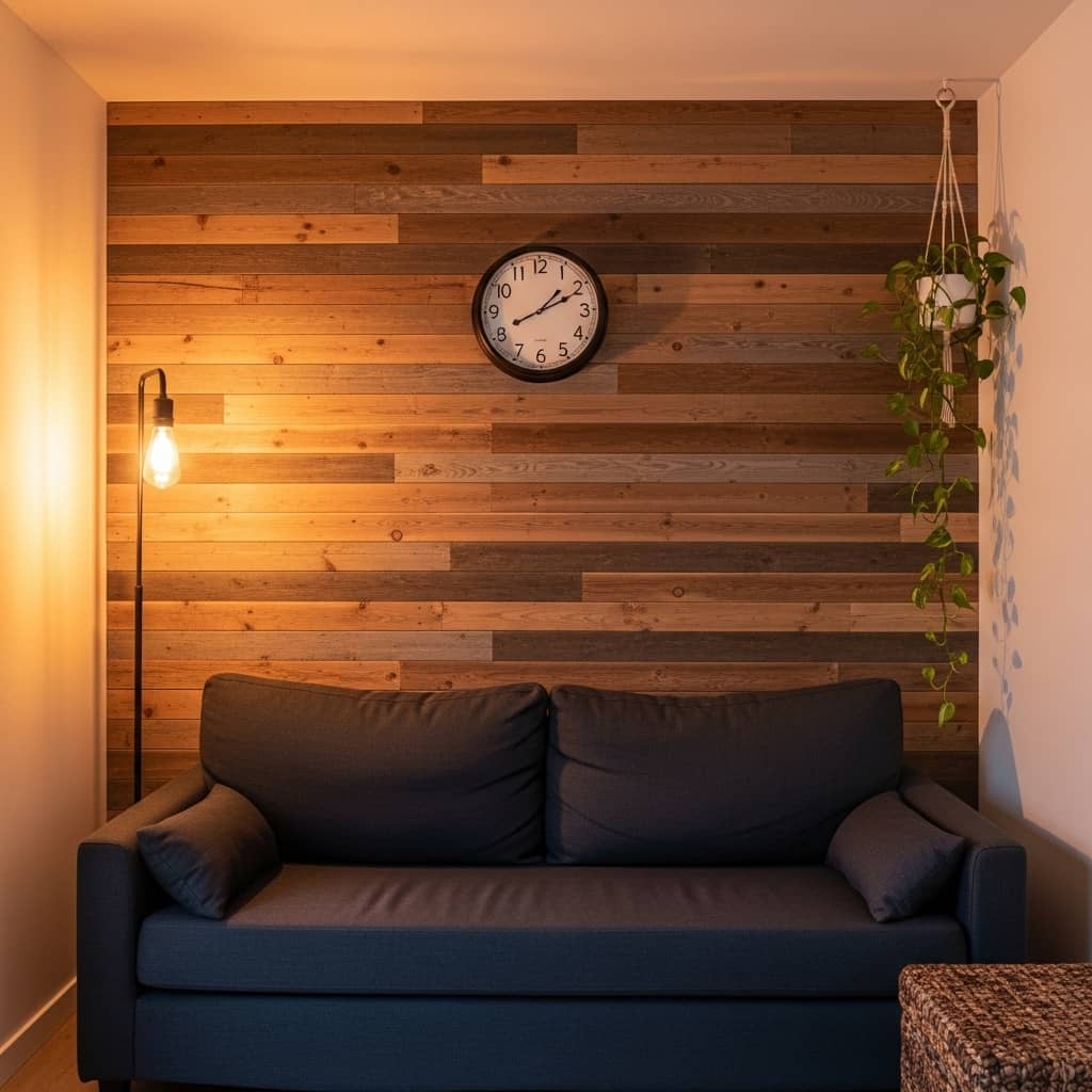
A reclaimed wood plank wall brings unmatched organic texture and warmth to a small living room that paint alone simply cannot produce. The natural variation in each plank’s grain, tone, and width creates a rich, visually complex surface that catches light differently at every hour of the day. I’ve seen compact living rooms with wood plank accent walls become the most talked-about feature in the entire home because the natural material feels so authentically warm and genuinely handcrafted in an age of flat, smooth surfaces.
Mixing plank widths, some at 3 inches and others at 5 to 6 inches, creates a more authentic, collected look compared to uniform-width boards installed in rigid rows. The varied widths mimic the look of genuine reclaimed barn wood where boards were never standardized. That’s why many rustic and industrial interior designers specify mixed-width planks when creating wood accent walls in compact living rooms and small dining areas.
- Adds rich organic texture to living room walls
- Creates warmth in small apartment spaces
- Mixed plank widths look authentically reclaimed
- Works with industrial and rustic decor styles
- Pairs beautifully with navy and dark linen furniture
Peel-and-stick wood plank panels make this look accessible for renters and non-DIY decorators who cannot install real lumber on their walls. Quality peel-and-stick wood veneer panels at retailers like Amazon or Home Depot cost between $30 and $60 per panel and cover approximately 15 square feet each. A standard accent wall behind a sofa, roughly 10 feet wide by 8 feet tall, requires approximately 5 to 6 panels for complete coverage.
Finishing the installed planks with a thin coat of clear matte sealant protects the wood surface from dust accumulation and everyday scuffs. A water-based polyurethane in matte finish preserves the natural wood appearance without adding an artificial shine that cheapens the organic texture. One coat applied with a foam roller takes about 30 minutes for a standard accent wall and extends the surface life by several years.
Floating Book Nook Shelf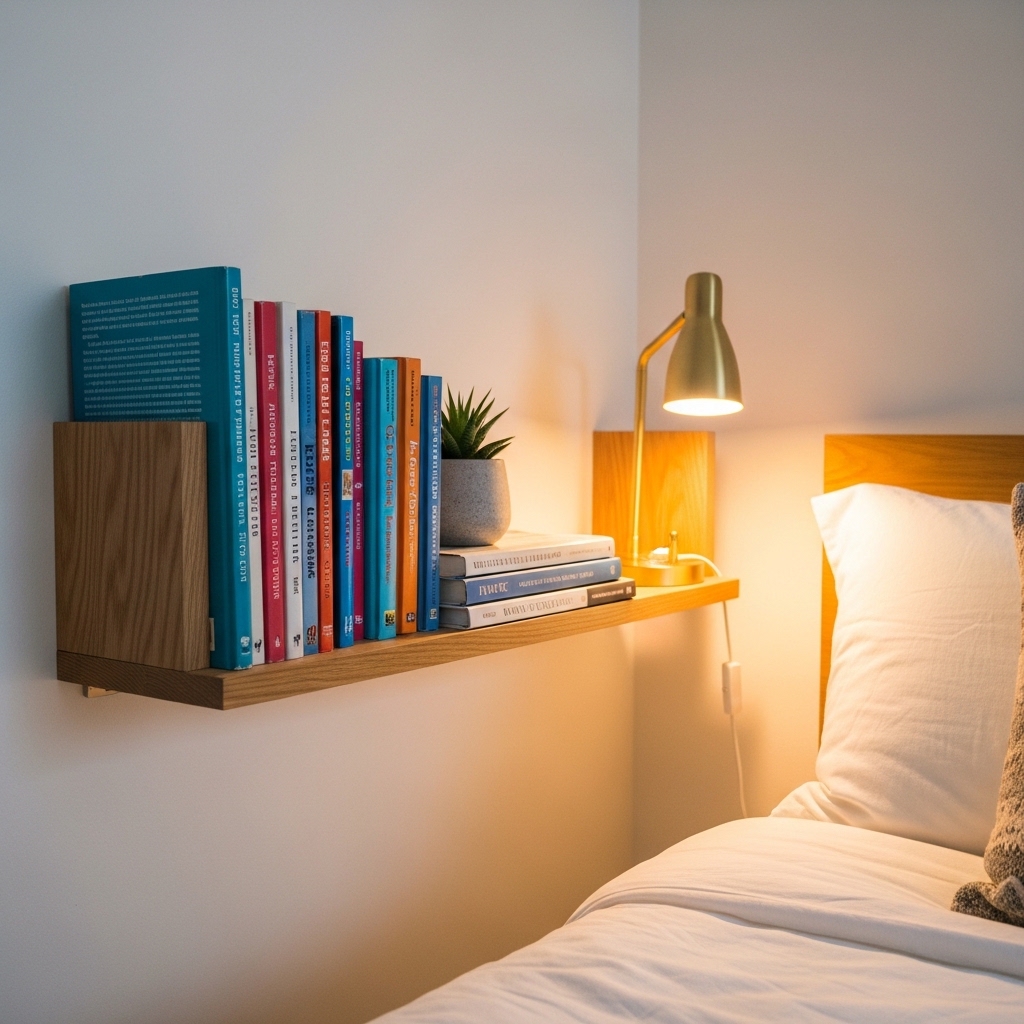
A floating book nook shelf beside the bed turns an unused wall strip into a functional, styled reading zone that adds enormous character to a compact bedroom. Books arranged with their colorful spines facing outward act as natural wall art while remaining fully functional. I’ve tried this approach in three different small bedrooms and it consistently delivers one of the highest personality-per-dollar ratios of any wall decor investment in the entire room.
Positioning the book nook shelf at headboard height, roughly 24 to 30 inches above the mattress surface, keeps books within easy reach while maintaining a clean sightline from the door. Mounting it directly on the side wall rather than above the bed prevents any risk of items falling during sleep. That’s why many interior designers recommend the side-wall placement for bedside floating shelves in small rooms where safety and function matter equally alongside style.
- Adds function and character to bedroom walls
- Books double as colorful natural wall decor
- Side-wall placement is safer than above-bed
- Works in narrow spaces beside the headboard
- Creates a cozy, personal reading nook feel
Keeping the shelf styled with exactly 6 to 8 books plus 1 to 2 small accessories prevents the narrow shelf from becoming a clutter magnet. A small succulent, one tiny candle, or a mini ceramic figurine fills the space beside the books without overwhelming the slim shelf surface. Editing regularly and removing items that no longer serve the aesthetic keeps the nook looking intentionally curated rather than casually accumulated.
Choosing books with spines in a coordinated color palette, like all-white, earthy neutrals, or deep forest greens, creates a cohesive, styled appearance. Removing dust jackets from hardcover books reveals clean linen or cloth spines in neutral tones that photograph exceptionally well. Many home decor creators use this specific technique to create bedroom shelf content that consistently performs as high-save material on Pinterest boards dedicated to cozy small-space styling.
Textured Plaster Effect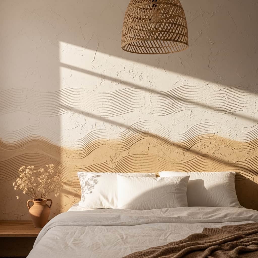
A textured plaster wall finish adds sculptural depth and artisan character to a small bedroom feature wall that no flat paint color can replicate. The hand-applied swirls and ridges catch directional light and cast soft micro-shadows that shift beautifully throughout the day as the light source moves. I’ve noticed that plaster-effect accent walls photograph spectacularly in afternoon natural light, which explains why this finish appears so frequently in the highest-performing Pinterest home decor content for small and mid-sized bedrooms.
Venetian plaster and limewash paint techniques both create this layered, organic wall texture and are accessible to beginner DIYers with a wide rubber trowel and basic application practice. Limewash paint at approximately $60 to $90 per gallon covers a standard accent wall in two to three coats and produces a softly mottled, aged surface that looks genuinely artisanal. That’s why many renters and first-time homeowners choose limewash as their first decorative paint technique before attempting true Venetian plaster.
- Adds sculptural depth to flat bedroom walls
- Catches light beautifully at every hour
- DIY-friendly with basic trowel application
- Creates a Mediterranean artisan aesthetic
- Limewash paint option costs under $90 total
Warm ivory, warm sand, soft clay, and pale terracotta tones work best for plaster-effect bedroom walls. Cool gray or stark white plaster finishes can feel clinical and overly modern in a space meant for warmth and rest. The warm tonal range keeps the textured finish feeling cozy and organic rather than architectural and cold, which matters especially in compact bedrooms where the wall surface occupies a significant portion of the room’s visual field.
Pairing the textured plaster wall with natural material furniture, like a rattan pendant light, a linen duvet, and a clay ceramic vase, reinforces the organic, artisan aesthetic cohesively. Hard, shiny, or industrial-finish furniture pieces clash with the softly textured surface and undermine the natural warmth of the finish. Keeping every material in the room within the same natural, earthy family ensures the plaster wall reads as the intentional anchor of a fully considered room concept.
DIY Paint Color Block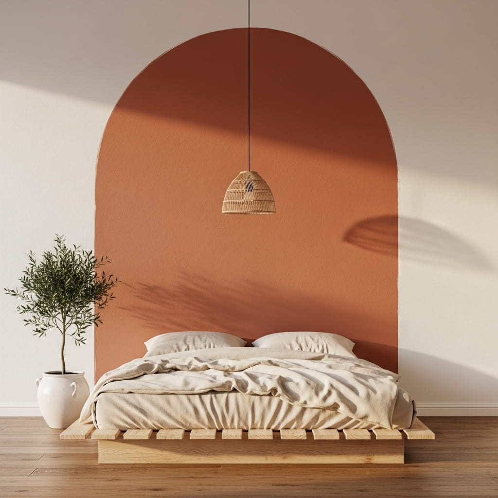
A painted color block directly on the wall creates a custom, architectural focal point that looks like a deliberate design decision rather than a simple paint job. The defined rectangle or arch of color frames furniture, mirrors, or shelving within it and gives the wall a built-in, purposeful quality. I’ve tried this technique in a small apartment living room using sage green against white walls, and the result looked so polished that multiple visitors assumed it was a professionally installed wall panel rather than a $12 paint project.
Choosing a muted, earthy shade for the color block, like sage green, dusty blue, warm clay, or soft terracotta, keeps the geometric shape feeling calm and sophisticated rather than jarring against the surrounding white walls. High-saturation primary colors can work in larger rooms but tend to overwhelm compact living spaces. The muted palette allows the color block to add genuine visual weight and definition without making the room feel smaller or more chaotic.
- Creates a custom focal point with basic paint
- Costs under $15 for a full color block
- Works perfectly behind mirrors and shelves
- Renter-friendly with landlord approval option
- Muted tones suit small room dimensions
Using painter’s tape to achieve perfectly crisp color block edges is the single most important step in the entire project. Pressing the tape edge firmly with a putty knife or credit card prevents paint from bleeding underneath and ruining the sharp geometric line. Removing the tape at a 45-degree angle while the paint is still slightly wet, rather than fully dry, produces the cleanest possible edge without chipping or peeling.
Sizing the color block to extend 8 to 12 inches beyond the mirror or shelf it frames on each side creates the ideal proportional relationship between the block and the object it highlights. A color block that barely extends past the framed item looks accidentally undersized and tentative. The generous extension gives the color zone enough visual authority to read clearly as an intentional architectural feature from across the entire room.
Lunar Phase Print Set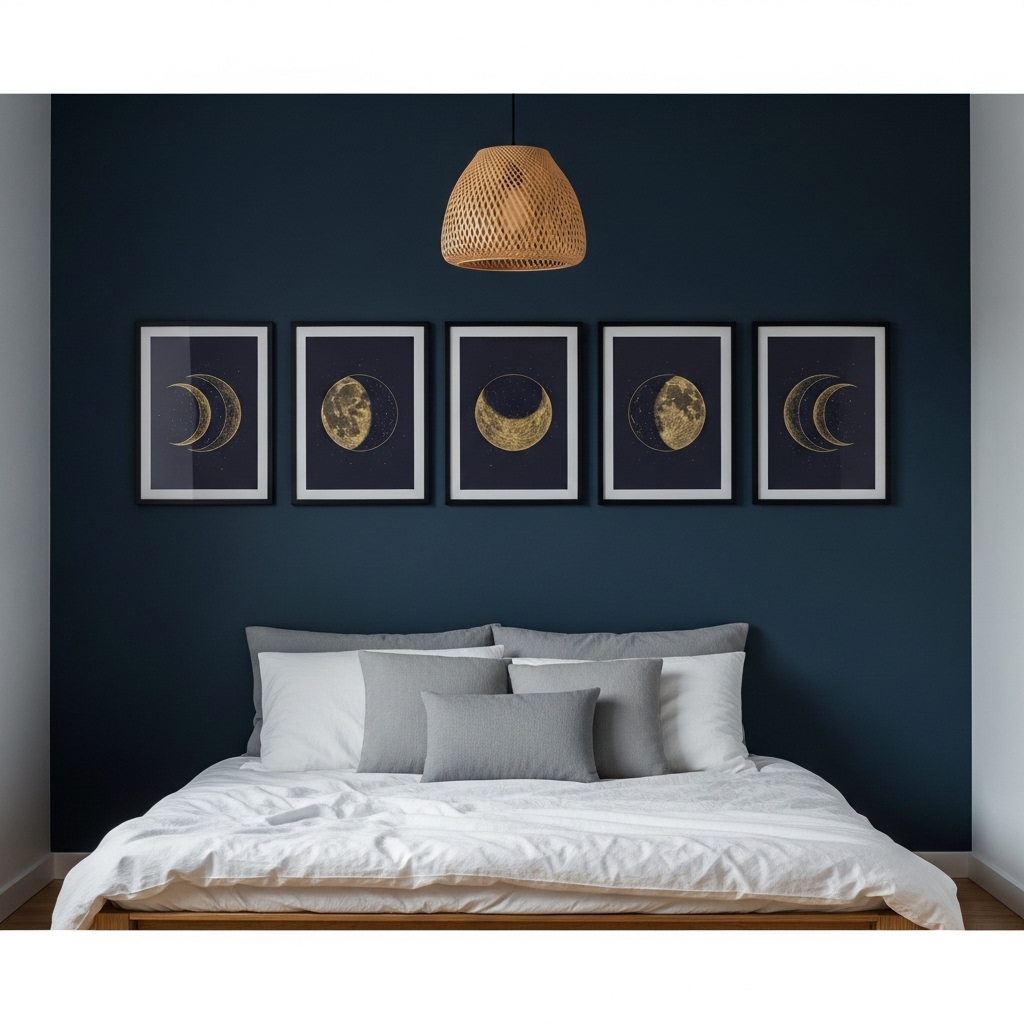
A lunar phase print series on a small bedroom wall creates a dramatic, celestial atmosphere that feels both deeply personal and visually sophisticated. Five prints in a tight horizontal row above the bed function as a unified artwork rather than five separate pieces, giving the arrangement the impact of a large canvas without occupying the same wall footprint. I’ve noticed that celestial-themed wall sets consistently rank among the highest-saved bedroom decor items on Pinterest, especially when displayed on a deep navy or charcoal wall background that amplifies the gold line art.
Dark navy walls paired with gold celestial line drawings create a rich, night-sky quality that no other color combination replicates in a compact bedroom. The contrast is dramatic yet deeply calming rather than harsh. That’s why many stylists recommend this dark-wall celestial pairing specifically for bedrooms over living rooms, where the intimate scale of the space allows the moody, atmospheric quality of the combination to feel immersive and intentional rather than overwhelming.
- Creates a dramatic celestial bedroom focal point
- Five-print sets function as one unified artwork
- Works beautifully on navy or dark accent walls
- Gold line art adds warmth to cool dark tones
- Printable sets cost under $15 total
Sizing each lunar print at 5×7 inches within an 8×10 mat creates the ideal proportional set for display above a standard queen or full-sized bed. The matted presentation adds the gallery-quality visual weight needed to anchor the dark wall without requiring large, expensive prints. Spacing each frame exactly 2 inches apart keeps the horizontal row clean, tight, and intentional across the full composition.
Hanging the five-print row so its center sits approximately 8 inches above the top of the headboard or bed frame creates the most natural, balanced relationship between the art and the furniture below it. A gap that is too large disconnects the prints from the bed visually and makes the wall feel unanchored. In my experience, this specific 8-inch gap rule applies consistently across nearly every bedroom wall arrangement regardless of print size or style.
Entryway Hooks With Art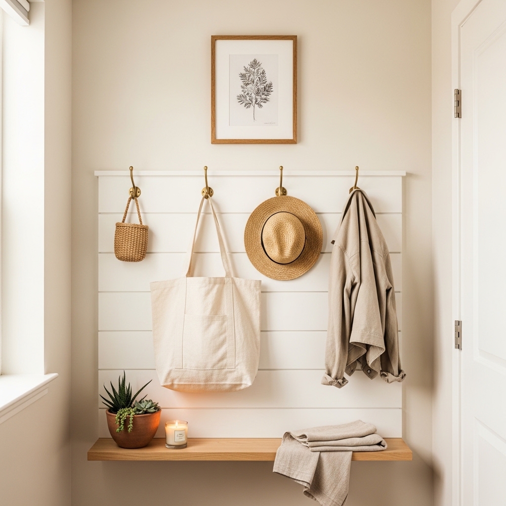
Combining decorative wall hooks with framed art above them turns a purely functional entryway zone into a styled, welcoming vignette that serves the homeowner every single day. Most entryways suffer from a bare coat hook screwed directly into an empty wall with zero context or styling around it. Adding a shiplap or painted plank backing panel behind the hooks and a small framed print above transforms the same functional items into a composed, intentional wall feature that immediately impresses anyone entering the home.
Brass hooks on a white shiplap background create a clean, cottage-inspired entryway aesthetic that suits both modern farmhouse and classic Scandi interior styles equally well. The warm metal tone of brass connects naturally to wood accents and linen textiles, pulling the entire entryway vignette into a cohesive material story. That’s why many interior decorators choose brass as their default hardware finish for small entryways where every visible element contributes significantly to the overall first impression of the home.
- Turns functional hooks into styled wall decor
- Creates a welcoming, complete entryway vignette
- Brass hooks suit farmhouse and Scandi styles
- Adds art above functional everyday items
- Works in narrow hallway wall decor setups
Using a slim 12-inch-deep floating shelf below the hooks at bench height creates a surface for daily-use items like keys, mail, and small plants without requiring a full console table. This shelf-plus-hooks combination delivers full entryway functionality within a wall footprint as narrow as 24 inches wide. For small apartments with tight entry corridors, this vertical wall solution outperforms any floor-standing furniture in terms of both style and practical spatial efficiency.
Keeping the hook panel and the framed art directly above it within the same 24 to 36 inch wall width creates a vertically stacked, unified composition. A taller arrangement that uses the full wall height, from the shelf at the bottom through the hooks in the middle to the art at the top, maximizes every inch of available vertical wall space. In my experience, this three-zone vertical arrangement works in entryways as narrow as 28 inches and still looks professionally styled.
Triptych Canvas Set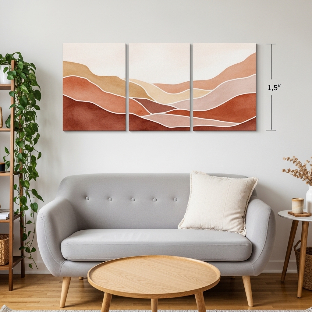
A three-panel triptych canvas set above a sofa delivers the visual scale of a single large artwork while fitting naturally into the specific proportions of a compact living room wall. The two small gaps between panels add a clean graphic rhythm to the horizontal arrangement that a single solid canvas cannot produce. I’ve seen this specific format perform exceptionally well in small living rooms where a 48 to 60 inch single canvas would feel overpowering but three coordinated 16×20 panels read as perfectly scaled and intentional.
Continuous-image triptychs, where one landscape, abstract design, or color wash flows seamlessly across all three panels, create the strongest visual impact because the eye naturally wants to complete the full image across the divided surface. Abstract watercolor landscapes in warm terracotta, dusty rose, and sand tones work especially well in small living rooms where the earthy warmth of the color palette complements natural wood, linen, and rattan furniture without competing for visual dominance.
- Creates large-scale art impact in small rooms
- Three panels suit compact living room walls
- Continuous-image designs read as one artwork
- Warm abstract tones suit most interior styles
- More affordable than one large custom canvas
Spacing the three panels exactly 1.5 inches apart keeps the triptych visually tight and unified. Wider gaps weaken the connection between panels and make the set read as three separate unrelated prints rather than one cohesive artwork. Narrower gaps make the set look cramped. The 1.5-inch spacing is the widely accepted standard spacing that professional art installers use for triptych sets of this format.
Centering the full triptych set directly above the sofa and leaving equal wall space on each side creates the most balanced, anchored composition. The combined width of all three panels plus their two gaps should ideally measure between two-thirds and three-quarters of the sofa’s total length. In my experience, a triptych that is too narrow for the sofa below it looks timid and undersized, while one that extends significantly beyond the sofa edges creates an unbalanced, top-heavy impression on the wall.
Staircase Photo Wall
A staircase wall is one of the most overlooked display opportunities in a small home, yet a well-arranged diagonal photo gallery here creates one of the most personal and emotionally resonant displays in the entire house. The diagonal arrangement naturally follows the angle of the stairs and creates a dynamic, flowing composition that flat walls cannot replicate. I’ve seen staircase photo walls stop guests mid-step to look closer at the images, making the staircase one of the most engaging and conversation-starting spaces in the home.
Following the stair angle with a consistent diagonal line through the center of all frames keeps the arrangement looking orderly and intentional rather than randomly scattered. The center points of each frame should travel along a straight diagonal line that runs parallel to the stair nosing angle. That’s why many interior stylists recommend measuring and marking this center-point line with a pencil before hanging a single frame, which prevents the entire arrangement from drifting off-angle mid-installation.
- Uses overlooked staircase wall space effectively
- Diagonal arrangement follows the stair angle naturally
- Personal photographs add warmth and character
- Mixed sizes create visual rhythm going upward
- Works beautifully in small two-story homes
Using a consistent black or dark walnut frame finish throughout the entire staircase gallery creates visual unity across the varied photograph subjects and sizes. Mixing multiple frame colors on a staircase wall creates chaos because the viewer’s eye cannot settle on a single organizing principle as it moves up the diagonal. One consistent frame finish acts as the visual thread that connects every individual print into a single, cohesive wall installation.
Leaving approximately 3 to 4 inches of wall space above the handrail and below the ceiling line keeps the gallery from feeling cramped between the stair railing and the ceiling above. The staircase wall naturally narrows as it rises, so placing larger frames on the lower stair sections and progressively smaller frames higher up mirrors this natural spatial taper elegantly. In my experience, this size-tapering approach makes a staircase gallery look purposefully designed rather than assembled one frame at a time without an overall plan.
Seasonal Wreath Rotation
Rotating a single wreath through four seasonal variations is one of the most cost-effective and visually impactful ways to keep a small living room wall feeling fresh, current, and intentionally styled all year long. Instead of purchasing multiple permanent wall pieces, one consistent wall-decor for small spaces strategy relies on a single signature hook and a seasonal wreath rotation that shifts the entire mood of the room with every change. I’ve used this approach for two years and guests consistently comment that my living room always feels newly decorated despite requiring almost no effort between seasons.
Each seasonal wreath costs between $18 and $45 depending on the materials, and storing the off-season wreaths flat in a large hat box or a labeled bin keeps them protected between rotations. Spring brings blush peonies and green eucalyptus, summer brings dried wildflowers in yellow and sage, autumn brings pampas and rust berry branches, and winter brings frosted pine and dried cotton stems. That’s why many home stylists treat wreath rotation as their single highest-return seasonal decorating habit in a compact home.
- Refreshes small living room walls seasonally
- One hook serves four completely different looks
- Each seasonal wreath costs $18 to $45
- Storage in hat boxes keeps wreaths protected
- Highest-return seasonal wall decor habit
Mounting a single large adhesive Command hook rated for 5 to 7 pounds handles most standard dried wreath weights without damaging rental walls. Removing and re-applying the hook with each seasonal swap can weaken the adhesive over time. A better long-term solution is a slim, low-profile nail rated for 10 to 15 pounds installed once, which supports every seasonal wreath rotation indefinitely without wall damage concerns for homeowners.
Pairing the seasonal wreath with a coordinated console shelf display below it locks the entire wall zone into a complete, seasonally cohesive vignette. Matching the candle color, dried stem tones, and textile textures on the shelf to the wreath above creates a layered, curated look that feels genuinely styled rather than simply decorated. In my experience, this two-zone vertical pairing, wreath above and styled shelf below, is the single most Pinterest-worthy wall arrangement possible in a compact living room with limited wall space.
Conclusion
Your small walls hold far more potential than you realize. Every bare wall in your home is an opportunity to add warmth, personality, depth, and genuine character to the space you live in every day. The 31 wall decor for small spaces ideas in this article cover every budget, every style, and every room type. From a single bold canvas to a seasonal wreath rotation, each idea delivers a real visual transformation without requiring a renovation. I’ve seen the right wall decor completely shift how a person feels inside their own home. Pick one idea today. Try it this week. Save this post on Pinterest so you can come back to it, and share it with a friend who needs fresh inspiration for their small space.
Frequently Asked Questions
What is the best wall decor for a very small bedroom?
A single large canvas, a leaning arch mirror, or a peel-and-stick wallpaper panel works best. Each creates a strong focal point without crowding the wall. Avoid too many small frames in a tiny bedroom. One well-chosen statement piece delivers more visual impact than five average ones combined.
How do I decorate a small wall without making the room feel smaller?
Use light-toned artwork, mirrors, and vertically oriented arrangements. Mirrors reflect light and create depth. Light-colored prints keep the wall feeling open. Avoid dark, heavy, or overly busy patterns in compact spaces. A single clean focal point always makes a small room feel more spacious and intentional.
What size art should I hang in a small room?
Go larger than feels comfortable. A print that spans at least two-thirds of the furniture width below it looks correctly proportioned. Most people choose art that is too small for the wall. A 24×36 inch canvas above a sofa reads as perfectly scaled in most compact living rooms.
Is peel-and-stick wallpaper safe for rental walls?
Yes, when applied and removed correctly. Always start with a clean, smooth wall surface. Pull the panels off slowly at a low angle to prevent paint lifting. Most quality peel-and-stick brands are specifically designed for rental-safe installation. Testing a small corner strip first confirms compatibility with your wall paint type.
How do I style floating shelves without making them look cluttered?
Use the rule of three. Group items in odd numbers per shelf section. Mix one tall item, one medium piece, and one low accent together. Include at least one small plant. Edit regularly and remove anything that does not serve the overall aesthetic or a clear functional purpose.
What wall decor works best in a small bathroom?
Framed botanical prints, pressed flower shadow boxes, and small round mirrors work beautifully. Stick to a tight horizontal arrangement above the vanity. Use matching frames in one consistent finish. Keep the total number of pieces between two and four. A clean, spa-like simplicity always photographs and functions best in compact bathroom walls.
Can I do wall decor in a rental apartment without losing my deposit?
Absolutely. Peel-and-stick wallpaper panels, washi tape geometric designs, adhesive Command hooks, leaning mirrors, and fabric tapestries all work without permanent wall damage. Many of these ideas require zero nails. Always check your lease agreement regarding wall mounting before installing anything that requires drilling or anchoring into the wall surface.