How to Style Bold Expressive Homes with Colour Maxxing
Staring at the same beige living room wall for three years can start to feel like living inside a blank page. That flat feeling is exactly what these colour maxxing room ideas are built to fix, one bold room at a time. This guide covers thirty fresh ways to bring saturated color into bedrooms, kitchens, bathrooms, and hallways alike. In my experience styling several rooms with jewel tones, a single accent wall under one hundred dollars often makes the biggest visual difference. Many stylists recommend starting with one bold color before layering in a second. This article walks through emerald bedrooms, ruby accent walls, and confident color pairings, so every room feels intentional instead of forgettable.
Emerald Green Bedroom
These colour maxxing room ideas open with an emerald green bedroom that turns four walls into a jewel-toned retreat. Velvet textures and brass accents deepen the color, creating a moody, romantic space perfect for rest.
- Emerald walls, jewel-tone drama
- Velvet headboard, rich texture pop
- Brass accents warm the depth
- Works in small, large bedrooms
This emerald bedroom works because dark, saturated color makes a room feel cocooned instead of cold. In my experience, jewel tones photograph beautifully in warm evening light and low lamp glow.
Sapphire Blue Living Room
A sapphire blue living room pairs deep, saturated walls with a mustard accent chair for striking contrast. This combination reads confident and current, working well in both small and open-plan spaces.
- Sapphire walls, deep saturated color
- Mustard chair, bold complementary pop
- Brass lighting, warm metallic contrast
- Great for open-plan living rooms
This sapphire room works because deep blue photographs beautifully against warm wood and brass finishes nearby. That’s why many stylists recommend pairing cool jewel tones with warm metallic accents for balance.
Ruby Red Accent Wall
A ruby red accent wall is a single saturated wall that anchors a room without repainting every surface. This dining room idea creates instant drama while keeping the rest of the space neutral.
- One bold wall, strong anchor
- Ruby red, dramatic dining focal
- Pairs with wood and rattan
- Weekend project under one hundred
This accent wall works because one bold surface commands attention while surrounding neutrals stay calm and grounded. So many homeowners choose ruby red for dining rooms meant for entertaining and gathering often.
Mustard Yellow Kitchen
A mustard yellow kitchen paints lower cabinets in a warm, saturated shade while keeping counters and walls neutral. This bold color choice energizes a kitchen without overwhelming the whole room.
- Mustard cabinets, warm energizing pop
- White counters, balanced neutral base
- Open shelving, displays ceramic pieces
- Mid-range project for lasting impact
This mustard kitchen works because warm yellow tones make a cooking space feel lively during morning routines. I’ve noticed homeowners feel more energized in kitchens painted with confident, saturated color choices.
Terracotta Orange Nook
A terracotta orange nook wraps a small reading corner in warm, earthy saturated color for instant coziness. This idea works especially well in narrow spaces or awkward room corners needing purpose.
- Terracotta walls, warm earthy tone
- Rattan chair, natural texture pairing
- Perfect for small reading corners
- Budget-friendly under seventy-five dollars
This terracotta nook works because warm orange tones feel grounding rather than overwhelming in a small footprint. That’s why many stylists recommend earthy saturated colors for cozy, purposeful reading corners at home.
Hot Pink Powder Room
A hot pink powder room turns the smallest room in the house into a bold, memorable statement space. This saturated color choice works because powder rooms invite more design risk-taking.
- Hot pink walls, bold statement
- Brass mirror, glamorous metallic touch
- Perfect for small powder rooms
- Weekend project under one hundred
This pink powder room works because a small space limits the color’s visual weight, keeping the look playful. So many homeowners choose bold shades here since guests only visit briefly.
Electric Blue Home Office
An electric blue home office uses a vibrant, saturated wall color to spark focus during long work sessions. This bold choice suits small home offices and converted closet nooks equally well.
- Electric blue, energizing workspace color
- Wood desk, warm grounding contrast
- Works in small office nooks
- Boosts focus during work-from-home days
This electric blue office works because bright, saturated color keeps energy levels up through afternoon work slumps. I’ve tried this in my own workspace, and the color genuinely shifts daily focus and mood.
Deep Purple Reading Corner
A deep purple reading corner wraps a small nook in rich, saturated color for a moody, cocooned feeling. This colour maxxing room idea works beautifully in bedrooms, hallways, or awkward corners.
- Deep purple walls, moody richness
- Velvet chair, luxurious cozy texture
- Great for small unused corners
- Low-maintenance paint, easy weekend update
This purple corner works because rich, dark color makes a small space feel intentional rather than forgotten. So many people turn a wasted corner into a favorite reading spot this way.
Forest Green Dining Room
A forest green dining room wraps the whole space in deep, saturated color for dramatic evening dinners. This idea pairs naturally with wood furniture and warm brass lighting throughout the room.
- Forest green, deep rich saturation
- Wood table, natural warm pairing
- Brass chandelier, refined dinner mood
- Ideal for holiday gatherings, dinners
This forest green room works because dark walls make candlelight and brass fixtures glow warmer after sunset. That’s why many stylists recommend deep greens for dining rooms used mostly during evenings.
Charcoal Black Statement Wall
A charcoal black statement wall grounds a living room in deep, dramatic color without darkening the whole space. This idea works because one bold wall reads sophisticated rather than heavy or closed.
- One dark wall, sophisticated anchor
- Charcoal black, dramatic bold contrast
- Pairs with light linen furniture
- Weekend project under one hundred
This charcoal wall works because contrast between dark paint and light furniture keeps the room feeling balanced. So many homeowners choose this combination when they want drama without losing brightness entirely.
Bold Color Blocking Wall
Bold color blocking is a technique where two or more saturated colors meet along a clean, defined line. This coral and navy combination creates a graphic focal point behind any bed frame.
- Two colors, clean graphic line
- Coral and navy, bold pairing
- Works in kids’ bedrooms too
- DIY project with painter’s tape
This color blocking works because the crisp division feels modern and intentional rather than accidental or messy. I’ve seen this technique work beautifully for renters testing bold color before committing fully.
Warm Cool Color Mix
A warm cool color mix pairs terracotta furniture with teal and navy accents for balanced visual temperature. This approach keeps a maximalist room from feeling chaotic or overly one-note in tone.
- Terracotta and teal, temperature balance
- Navy accents, deepen the contrast
- Suits eclectic or boho rooms
- Prevents one-note color fatigue
This temperature mix works because warm and cool tones together create visual movement without clashing or competing. That’s why many stylists recommend combining both temperatures when building a confident color scheme.
Neutral Base Bold Accent
A neutral base with one bold accent keeps a room calm while still making a confident color statement. This approach works well for renters or anyone easing into saturated color choices.
- White base, calm neutral backdrop
- Cobalt chair, single bold statement
- Renter-friendly, no permanent paint needed
- Easy to swap later
This neutral base approach works because one bold piece reads intentional against a calm, uncluttered backdrop nearby. So many people start their color maxxing journey with this lower-commitment styling method first.
All Blue Bedroom
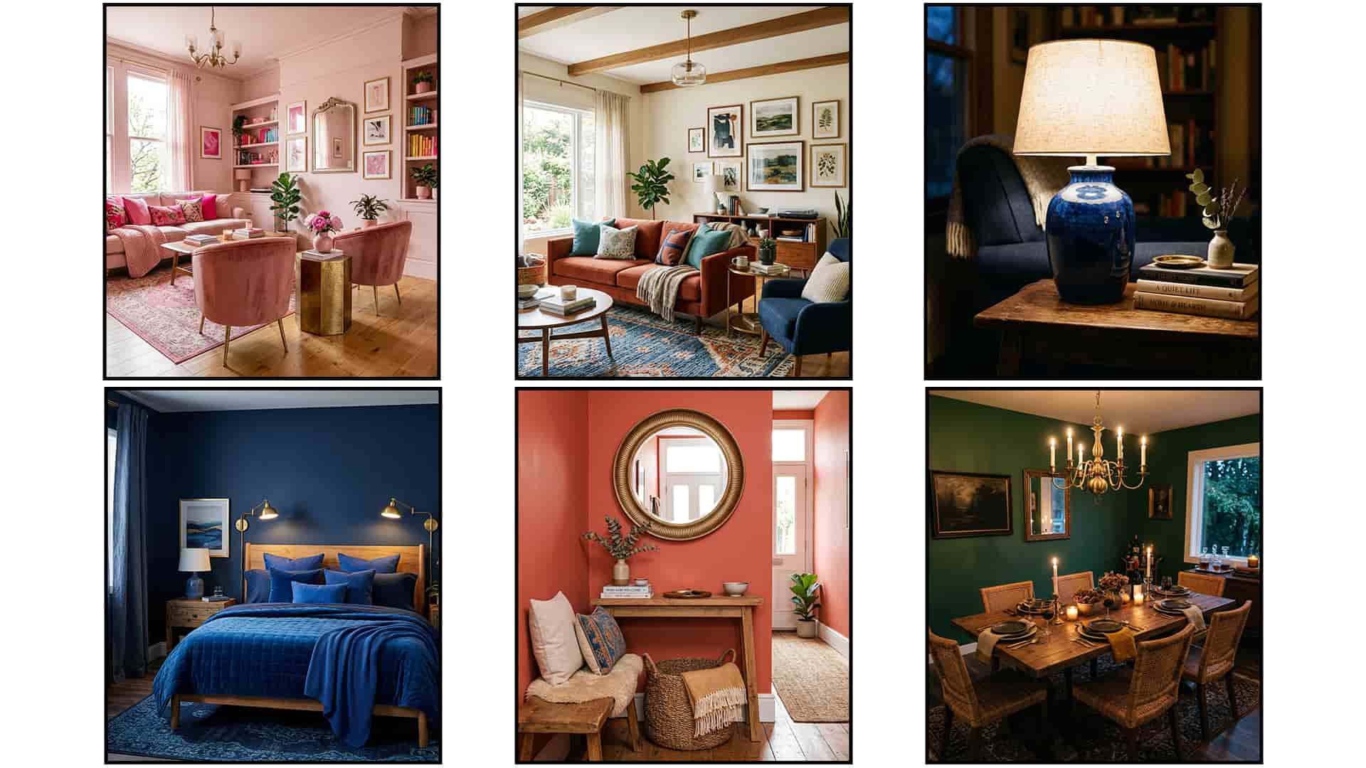
An all blue bedroom layers multiple shades of one color, from navy walls to sapphire bedding, for an immersive effect. This monochromatic approach feels cohesive without requiring any color-matching guesswork at all.
- Multiple blue shades, immersive layering
- Navy walls, sapphire bedding pair
- Monochromatic scheme, zero color guesswork
- Restful, calming bedroom atmosphere overall
This monochrome room works because layered shades of one color create depth without visual clutter or confusion. I’ve noticed guests often find single-color rooms surprisingly calming compared to busy, mixed palettes.
All Pink Living Room
An all pink living room layers blush, rose, and hot pink shades together for a bold, immersive color moment. This monochromatic approach reads confident rather than childish once tones are layered well.
- Blush to hot pink shades
- Rose velvet, adds luxurious texture
- Monochromatic scheme, cohesive by design
- Suits eclectic, glam rooms
This pink room works because varied shades of one hue create sophistication instead of a flat, single-note look. That’s why many stylists recommend layering multiple tones when committing to one bold color.
Rich Burgundy Study
A rich burgundy study wraps a small workspace in deep, wine-toned color for a moody, focused atmosphere. This idea suits home offices, libraries, or converted closet nooks needing a bold identity.
- Burgundy walls, wine-toned sophistication
- Leather chair, classic warm texture
- Great for small home offices
- Deepens focus during evening work
This burgundy study works because dark, saturated walls create a cocoon effect that limits visual distraction nearby. That’s why many stylists recommend deep wine tones for rooms meant for concentration and calm.
Jewel Tone Bedroom
A jewel tone bedroom is a definition worth knowing: a room layered with rich, saturated colors like emerald, sapphire, and amethyst together. This combination reads luxurious without needing gold accents everywhere.
- Emerald, sapphire, amethyst, layered richness
- Wood furniture, warms the palette
- Works in medium, large bedrooms
- Luxury feel, small budget
This jewel tone room works because multiple rich colors together read as intentional richness, not clashing chaos. I’ve seen this style work beautifully for bedrooms meant to feel like a retreat.
Colorful Gallery Wall
A colorful gallery wall groups bold, saturated artwork together instead of matching every frame to one shade. Five to seven pieces create the strongest visual impact in a narrow hallway space.
- Five to seven pieces ideal
- Mismatched frames, playful eclectic feel
- Two-inch spacing between each piece
- Works beautifully in narrow hallways
This gallery wall works because bold, varied color reads as curated personality rather than random mismatched clutter. So many homeowners choose this layout because it hides small wall imperfections in older homes.
Bold Kitchen Cabinets
Bold kitchen cabinets swap standard white for a deep, saturated color like forest green or navy blue. This one bold swap shifts a kitchen’s entire personality without any structural renovation required.
- Forest green cabinets, deep saturation
- Brass hardware, warm rich contrast
- Mid-range project, no renovation needed
- Pairs with white marble counters
This cabinet color works because paint costs far less than replacing cabinets while delivering an equally dramatic result. I’ve noticed kitchens with bold cabinet color sell faster once buyers see the personality.
Colorful Staircase Design
A colorful staircase design paints each stair riser a different saturated shade for a playful rainbow effect. This idea works especially well in entryways or hallways that feel plain or overlooked.
- Multi-color risers, playful rainbow effect
- Wood treads, natural grounding contrast
- Great for entryway stairs
- Weekend DIY, paint and tape
This staircase idea works because a rarely noticed feature becomes an unexpected focal point guests always comment on. That’s why many stylists recommend painted risers for homes wanting personality without major renovation.
Bold Entryway Color
A bold entryway color sets the tone for an entire home the moment guests step through the door. Deep coral or another saturated shade works well even in narrow hallway entries.
- Deep coral, bold impression
- Wood bench, warm functional seating
- Works in narrow hallway entries
- Weekend project under one hundred
This entryway works because a bold first impression signals personality before guests even see the rest of the home. So many homeowners choose this space for their boldest color first, since it’s smaller.
Vibrant Bathroom Tiles
Vibrant bathroom tiles bring saturated color into a small, often-overlooked room without repainting large wall surfaces. Emerald green or sapphire blue tiles pair beautifully with warm brass bathroom fixtures nearby.
- Emerald tiles, jewel-toned bathroom drama
- Brass fixtures, warm metallic pairing
- Perfect for small guest bathrooms
- Mid-range project, lasting waterproof color
This tiled bathroom works because tile holds saturated color better than paint in a humid, high-moisture room. I’ve seen this style work beautifully for small guest bathrooms needing a memorable identity.
Saturated Curtain Statement
A saturated curtain statement adds bold color through fabric instead of paint, making it fully rental-friendly. Coral or mustard curtains against neutral walls create instant visual warmth in any room.
- Bold coral curtains, rental-friendly color
- Neutral walls, calm supporting backdrop
- No paint required, easy install
- Budget option under eighty dollars
This curtain statement works because fabric color reads just as bold as paint without any permanent commitment needed. That’s why many renters choose curtains first when testing saturated color at home.
Bold Throw Pillow Mix
A bold throw pillow mix layers three or four saturated colors together on one neutral sofa for instant personality. This combination works because pillows cost little and change in minutes.
- Three or four colors mixed
- Hot pink, mustard, teal combination
- Budget swap under sixty dollars
- Easy seasonal color rotation option
This pillow mix works because mixing patterns and saturated shades on one neutral base feels curated, not chaotic. I’ve noticed even five minutes of pillow styling changes a whole room’s energy.
Colorful Bedding Layers
Colorful bedding layers stack a saturated duvet with patterned pillows and a contrasting throw for depth. This layered approach turns a plain bed into the room’s clear focal point instantly.
- Cobalt duvet, bold saturated base
- Patterned pillows, added visual texture
- Mustard throw, warm contrasting layer
- Easy to update each season
This bedding idea works because layered color and pattern feel intentional, not overwhelming, when kept to one palette. So many people refresh a whole bedroom just by changing bedding layers alone.
Painted Planter Corner
A painted planter corner groups three bold, hand-painted pots at different heights for a playful color moment. This idea works in any room needing a small, budget-friendly styling update fast.
- Three painted planters, playful color
- Coral, teal, mustard combination pop
- DIY project under thirty dollars
- Works in living rooms, offices
This planter corner works because small painted objects deliver big color impact without any wall commitment needed. I’ve tried this in several corners, and plants always make saturated color feel more alive.
Bold Lamp Design
A bold lamp design uses one saturated ceramic base to add color without touching walls or furniture at all. This small swap works in bedrooms, offices, and living rooms alike.
- Cobalt base, bold accent
- Cream shade, softens the saturation
- Budget option under fifty dollars
- Works on nightstands, side tables
This lamp idea works because a single bold object can carry a room’s color story without repainting anything. That’s why many stylists recommend statement lamps for renters testing bold color first.
Colorful Bookshelf Display
A colorful bookshelf display arranges books by color, from warm reds through yellows, for a rainbow effect. This styling trick turns an ordinary bookshelf into a genuine room focal point instantly.
- Books arranged by color, rainbow
- Ceramic vases break up rows
- Free styling, items already owned
- Works in living rooms, offices
This bookshelf idea works because rainbow-sorted books create instant visual rhythm without spending any money at all. I’ve seen this style work beautifully for anyone wanting color without buying new decor.
Contrasting Color Pairing
Contrasting color pairing places complementary shades, like purple and mustard, directly across from each other in one room. This combination creates energy and visual tension that feels alive and current.
- Purple and mustard, complementary energy
- Brass accents, warms the contrast
- Works in living rooms, bedrooms
- Bold choice for confident decorators
This contrasting pairing works because opposite colors on the wheel naturally draw the eye and create visual movement. So many people choose this combination when they want a room that feels genuinely alive.
Confident Color Focal Point
These colour maxxing room ideas close with a confident color focal point that ties every earlier idea together. A teal wall behind an orange sofa proves bold pairings can still feel balanced.
- Teal and orange, bold pairing
- Brass lamp, warms the contrast
- Works as the clear anchor
- Ties every earlier idea together
These colour maxxing room ideas end here because one confident focal point gives a maximalist room clear direction. So many people find that starting with one bold pairing makes every other choice easier.
Conclusion
There you have it , thirty colour maxxing room ideas to bring bold, confident color into every corner of your home. From emerald bedrooms to ruby dining rooms, each idea offers an easy way to feel expressive without a full renovation. I’ve seen how one saturated wall can shift how an entire room feels day to day. Pick one room to start, or work through several ideas over a few weekends. Save this article on Pinterest, and share it with a friend planning their own bold refresh. Your more expressive, colorful home is only one confident choice away.
FAQs
What is colour maxxing in home design?
Colour maxxing means using bold, saturated color throughout a room instead of sticking to safe neutrals. It often includes jewel tones, accent walls, and confident color pairings in one space.
Is colour maxxing hard to pull off in a small room?
No, small rooms often handle bold color better since the saturation feels contained rather than overwhelming. Powder rooms and reading nooks are popular starting points for first-time colour maxxing.
How do I choose colors that work well together?
Start with one bold base color, then add a complementary or contrasting shade for balance. Warm and cool tones paired together, like mustard and navy, create energy without clashing.
Will bold color make my home harder to sell later?
Bold color rarely hurts resale value if it stays on paint rather than fixed materials like tile. A fresh coat of neutral paint can update a room in under a weekend.
Can renters try colour maxxing without painting?
Yes, renters can use bold curtains, bedding, and throw pillows to test saturated color without touching walls. These swaps cost under one hundred dollars and remove easily when moving out.
How many bold colors should one room have?
Most designers recommend two to three main colors per room to keep the look intentional. Adding a neutral base helps balance multiple saturated shades without feeling chaotic.